Trying Automated ML

Some students had asked me for my opinion on automated tools for machine learning. The thought occurred that I hadn’t done much with them recently, and it was about time I gave the much-hyped time savers a go – after all, aren’t they going to make data scientists like me redundant?

In today’s post, I’ll be trying out Google’s AutoML tool by throwing various datasets at it and seeing how well it does. To make things interesting, the datasets I’ll be using will be from Zindi competitions, letting us see where AutoML would rank on the player leader-board. I should note that these experiments are a learning exercise, and actually using AutoML to win contests is almost certainly against the rules. But with that caveat out the way, let’s get started!

How it works

AutoML (and other similar tools) aims to automate one step of the ML pipeline – that of model selection and tuning. You give it a dataset to work on, specify column types, choose an output column and specify how long you’d like it to train for (you pay per hour). Then sit back and wait. Behind the scenes, AutoML tries many different models and slowly optimizes network architecture, parameters, weights… essentially everything one could possibly tweak to improve performance gets tweaked. At the end of it, you get a (very complicated) model that you can then deploy with their services or use to make batch predictions.

The first step with AutoML tables – Importing the data.

The resultant models are fairly complex (mine were ~1GB each fully trained) and are not something you can simply download and use locally – you must deploy them via Google (for an extra fee). This, coupled with the cost of training models, makes it fairly expensive to experiment with if you use up your trial credits – so use them wisely.

Fortunately, there are other ways to achieve broadly the same result. For example, AutoKeras. Read more about that here.

Experiment 1: Farm Pin Crop Detection

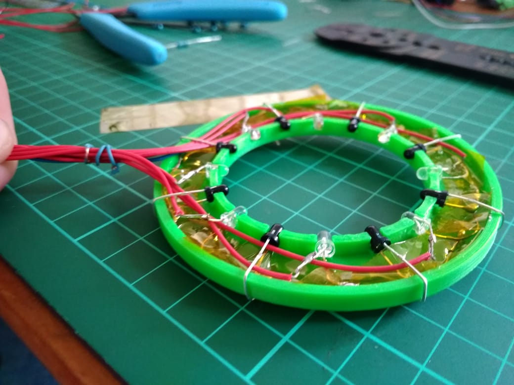
This competition involves a classification problem, with the goal being to predict which crop is present in a given field. The training data is provided as field outlines and satellite images – not something that can effortlessly slot into AutoML tables. This meant that the first step was to sample the image bands for the different fields, and export the values to a CSV files for later analysis (as described in this post). This done, I uploaded the resultant training file to cloud storage, selected the table, chose my input and output columns and hit go.

AutoML ‘Evaluate’ tab showing model performance.

The scoring metric for this competition is log loss. My previous best (using the same training data to train a random forest model) scored around 0.64 (~20th on the leaderboard). So a score of <0.6 looked promising. I uploaded the test set, hit predict and then manually cleaned up the output to match the submission format for Zindi. Score? 0.546, putting me in 12th place. No feature engineering besides sampling some satellite images, no manual tweaking of model parameters…. not bad!

I was quite pleased with this result. I enjoy the feature engineering side of things, but the tedium of hyper-parameter tuning is less appealing to me. If this tool can magically let me skip that step, it’s a win in my book! I may re-visit this with some added features, information from more images and perhaps a trick or two to enlarge the training set.

Experiment 2: Traffic Jam

Spurred on by the first success, I turned to the Traffic Jam competition since I still had the dataset on my laptop. This was a regression problem, with the goal being to predict the number of tickets sold for a given trip into Nairobi. The training data was fairly sparse, with only ~2000 rows to work from. Still, I figured it was worth a shot and threw a few node hours worth of Google-managed ML magic at the problem.

An MAE of 3.4, hypothetically equivalent to ~3rd place!

The evaluation results had me excited – and MAE of 3.4 would have placed the model in third place had the competition remained open. I hastily uploaded the predictions to Zindi, to see the score of… 5.3 (160th place). Now, I might be missing some glaring error in the way I formatted predictions for upload, but I suspect that the issue is with AutoML. It’s not really designed for such small datasets. From the website: “Depending on how many features your dataset has, 1,000 rows might not be enough to train a high-performing model.” The impressive MAE shown in the results tab is for one particular test set, and it seems that for the Zindi test set we were simply not as lucky. Another potential factor: The random test set will have sampled from the same date range as the training data, whereas the Zindi test set was for a different time period. In cases like this, a non-shuffled test/train split can be a better indicator of true performance.

So, we’ve learnt something new! The magic tool isn’t magic, and just like any other method it needs good training data to make good predictions.

Experiment 3: Sendy

I couldn’t resist trying it out once more on the newly launched Sendy Competition. I merged the Riders info into the train and test sets, uploaded the data, gave it an hour of training time and set it going. The goal is to minimize RMSE when predicting travel time between two locations (for deliveries). I also did some modelling myself while I waited for the AutoML training to finish.

Scores (RMSE for predicted time in seconds)
My first attempt (Catboost on provided data): 734 (7th place when this post was written)
First place: 721
Google AutoML: 724 (4th place until I convince them to remove my latest entry)

Not too shabby! To me, one of the great uses of a tool like this is to give a ballpark for what a good model looks like. Without the Zindi leaderboard, I wouldn’t have a way to gauge my model performance. Is it good? Could it get better with the same data? Now I can compare to the AutoML, using it as a ‘probably close to best’ measure.

Where next?

These quick tests have convinced me that these automated tools can be a useful part of my workflow, but are not a complete replacement for manual experimentation, exploration, feature engineering and modelling. I intend to play around more with AutoML and other tools in the near future, so stay tuned for a continuation of this series.

Zindi Competition 2 – Trying CatBoost on the Traffic Jam Challenge

Zindi ran a challenge predicting bus ticket sales into Nairobi. It is now closed, but we can still make predictions and see how they would have done. This was a very quick attempt, but I wanted to try out CatBoost, a magical new algorithm that’s gaining popularity at the moment.

With a little massaging, the data looks like this:

The ‘travel_time’ (in minutes) and ‘day’ columns were derived from the initial datetime data. I’ll spare you the code (it’s available in this GitHub repo) but I pulled in travel times from Uber Movement, and added them as an extra column. The test data looks the same, but lacks the ‘Count’ column – the thing we’re trying to predict. Normally you’d have to do extra processing: encoding the categorical columns, scaling the numerical features… luckily, catboost makes it very easy:

Training the model

This is convenient, and that would be enough reason to try this model first. As a bonus, they’ve implemented all sorts of goodness under the hood to do with categorical variable encoding, performance improvements etc. My submission (which took half an hour to implement) achieved a score of 4.21 on the test data, which beats about 75% of the leaderboard. And this is with almost no tweaking! If I spent ages adding features, playing with model parameters etc, I have no doubt this could come close to the winning submissions.

In conclusion, I think this is definitely a tool worth adding to my arsenal. It isn’t magic, but for quick solutions it seems to give good performance out-of-the-box and simplifies data prep – a win for me.

This was a short post since I’m hoping to carry on working on the AI Art contest – expect more from that tomorrow!

ML and IR Tomography

I studied Electrical and Computer Engineering at UCT, and the final year project was my chance to really dive deep into a topic. I chose IR tomography, and explored various questions around that topic. For today’s post, I’ll focus on one small aspect: the use of machine learning. This post will go through some background and then show a couple of ML models in use. For much more detail and my full thesis, see this GitHub repository.

Background

This project arose because I wanted to do some experiments with Computed Tomography, but I didn’t know enough to see what would work and what wouldn’t. How many sensors does one need to achieve a particular goal for resolution or performance? What geometries work best? And what if we can’t keep everything nice and regular? 

I built some tools that let me simulate these kinds of arrangements, and did some early experiments on image reconstruction and on the use of machine learning (specifically neural networks) to make sense of readings. Even with a weird arrangement like the one on the right, I could make some sense of the data. For more information on the simulation side, see the report in the GitHub repository.

I tested out these arrangements in the real world by building some fixed arrangements, and by using a 3D printed scanner to position an LED and a phototransistor (PT from now on) in different locations to slowly simulate having many detectors and emitters. Using light as opposed to X-rays means cheap emitters and detectors, and of course much less danger.

A ring of 8 LEDs and 8 PTs. Larger rings were also constructed, and the scanner could simulate arrangements of >1000 sensors and emitters.

By taking a set of readings, we can start to estimate how much light travels along different paths, and thus build up an image of whatever is being scanned. This works well with lots of readings from the scanner:

A reconstructed image of some small nails. The scanner could resolve objects less than 1mm in size.

However, for arrangements with relatively few sensors (such as the static arrangement of 8 shown above), the reconstructed images are an apparently meaningless blur. The goal of this project was to use ML to make sense of these sets of readings, for example by identifying objects placed within the sensor ring or estimating their position.

Model Selection

To answer the question “can machine learning be useful”, I needed to pick a good approach to take. Simply throwing the data at a decision tree and then noting the performance wouldn’t cut it – every choice needs to be justified. I wrote a notebook explaining the process here, but the basics are as follows:

  1. Define your problem (for example, classifying objects) and load the data
  2. Pick a type of model to try (for example, Logistic Regression)
  3. Train a model, and see how well it performs by splitting your data into training and testing sets. Use cross-validation to get more representative scores.
  4. Tune the model parameters. For example, try different values on ‘gamma’ (a regularisation parameter) for a Support Vector based classifier.
  5. Repeat for different types of model, and compare the scores
Choosing the optimum number of hidden layers for a Multi-Layer Perceptron model (Neural Network)

For example, in the case of object classification, a neural network approach worked best (of the models tested):

Model scores on a classification task

Object Classification

Using the ring with 8 LEDs and 8 PTs, I’d place an object randomly within the ring. The object (one of four used) and location (which of four ‘quadrants’ contained the object) were recorded along with a set of readings from the sensors. This data was stored in a csv file for later analysis.

Using the model selected according to the method in the previous section, I was able to achieve an accuracy of 85% (multi-class classification) or 97% (binary classification with only two objects) using 750 samples for training. More training data resulted in better accuracy.

Model performance with more training samples for multi-class classification (orange)
and binary classification (blue)

This was a fun result, and a good ML exercise. The data and a notebook showing the process of loading the data and training models can be found in the ‘Model Selection’ folder of the GitHub repository.

Position Inference

Here, instead of trying to identify an object we attempt to predict it’s location. This requires knowing the position precisely when collecting training data – a problem I solved by using a 3D printer to move the object about under computer control.

Gathering training data for position inference

This results in a dataset consisting of a set of readings followed by an X and Y position. The goal is to train a model to predict the position based on the readings. For the ring of 8, the model could predict the location with an error of ~10% of the radius of the ring – approximately 7mm. For the ring of 14 (pictured above, and the source of the linked dataset), I was able to get the RMSE down to 1.6mm (despite the ring being larger) using the tricks from the next section. You can read more about this on my hackaday.io page.

Playing a game with the sensor ring.

The ring can take readings very fast, and being able to go from these readings to a fairly accurate position opens up some fun possibilities. I hooked it up to a game I had written. A player inserts a finger into the ring and moves it about to control a ‘spaceship’, which must dodge enemies to survive. It was a hit with my digs-mates at the time.

Using Simulation to boost performance

One downside of this approach is that it takes many training samples to get a model that performs adequately. It takes time to generate this training data, and in an industrial situation it might be impossible to simulate all possible positions in a reasonable time-frame. Since I already had a simulator I had coded, why not try to use it to generate some fake training data?

Using purely simulated data resulted in some spectacularly bad results, but if a model was ‘primed’ with even a small real-world training dataset (say, 50 samples) then adding simulated data could improve the model and make it more robust. I’ll let the results speak for themselves:

Model performance for position inference with and without simulated data for training

The simulator didn’t map to real life exactly, and no doubt could be improved to offer even more performance gains. But even as-is, it allows us to use far less training data to achieve the same result. Notice that a model trained on 150 samples does worse than one using only 50 samples but augmented with extra simulated data. A nifty result to keep in mind if you’re ever faced with a dataset that’s just a little too small!

Conclusions

I had a ton of fun on this project, and this post only really scratches the surface. If you’re keen to learn more, do take a look at the full report(PDF) and hackaday project. This is a great example of machine learning being used to get meaningful outputs from a set of noisy, complicated data. And it shows the potential for using simulation of complex processes to augment training data for better model performance – a very cool result.

I’m thinking about moving this website in a different direction as I start on a new project – stay tuned for news!

Mapping Baobabs, Part 3 – Model Applicability

In the previous two posts, we built a Species Distribution Model and used it to predict the density of Baobab trees in Zimbabwe. Then we tried some more complex models, trained a decision tree regressor and imported it into Google Earth Engine. We showed various metrics of how well a model does, but ended with an open question: how to we tell how well the model will do when looking at a completely new area? This is the subject we’ll tackle in today’s post.

The key concept here is distance from the sample space. We sampled at a limited number of geographic locations, but there is no way these locations completely cover all possible combinations of temperature, rainfall, soil type and altitude. For example, all samples were at altitudes between 300 and 1300m above sea level. We might expect a model to make reasonable predictions for a new point at 500m above sea level. But what about a point at 290m elevation? Or 2000m? Or sea level? Fitting a linear model based purely on altitude, we see the problem clearly:

Line of best fit: Elevation vs Density

Negative tree densities at high altitude? Insanely high densities at sea level? Clearly, extrapolating beyond our sample space is risky. Incidentally, if it looks to you like there are two Gaussian distributions there in the data you are not alone – they might correspond to the two types* of baobabs found on mainland Africa. Until recently, conventional wisdom held that there is only one species present, and this is still contested. See a related paper I worked on here [1]. A more complex model might help, but that’s besides the point. A model’s predictions are only valid for inputs that are close enough to the training data for extrapolation to make sense.

So how do we deal with this? A simple approach might be to define upper and lower bounds for all input variables and to avoid making predictions outside of the range covered by our training data. We can do this in GEE using masking:

Black areas fall within 80% bounds for all variables

This is a reasonable approach – it stops us doing much dangerous extrapolating outside our sample space and has the added benefit of clearly conveying the limitations of the model. But we can do better. Imagine an area that is almost identical to some of our training data, but differs in a few attributes. Now further imagine that none of these attributes matter much to baobabs, and in any case they are only just below our thresholds. Surely we can expect a prediction in this area to have some value? We need a way to visualise how far away a point is from our sample space, so that we can infer how bad our predictions for that point are likely to be.

Enter what I call the |Weighted Distance Vector|. We represent each input as a dimension. We consider how far away a point is from our sample space along each dimension, and compute the vector sum of these distances. I say the ‘weighted’ sum since we can scale the distance on each axis to reflect the relative importance of that variable, attaching higher weight to variables with larger effects on the output. Let’s clarify with an example.

Considering only two variables, elevation and temperature, we can represent all our training data as points (blue) on a grid where the X axis represents elevation and the y axis temperature. We’ll draw out our limits around the training data using bounds covering 90% of our data. A point within the limits has a |WDV| of 0. Now consider a point outside the limits (red). It’s 250m higher than any we’ve seen – 0.25 times the range of elevations observed. It’s 2.5 degrees cooler than any of our sampled locations, which is 0.3 times the upper-lower bounds for temperature. The distance is sqrt(0.25^2 +0.3^2) = 0.39. However, altitude has a large influence on distribution, while temperature does not. Scaling by appropriate weights (see the penultimate paragraph for where these come from) we get |WDV| = sqrt((0.173*0.25)^2 +(0.008*0.3)^2) = 0.043. The key point here is that the |WDV| captures the fact that elevation is important. A point at 750m elevation with a mean temp of 30 °C will have a low |WDV| (0.005), while one with a mean temp of 23 °C but an altitude of 1600m will have a high |WDV| (0.02).

A point outside our sampled region

To do this in GEE is fairly simple, since we can map functions over the input images to get the |WDV| at each location. This script shows it in action. And the result gives us much more information than the mask we made earlier. Red areas have a very small |WDV|, and we expect our model to do well there. White areas are out of scope, and I’d take predictions in the yellow regions with a grain of salt. What isn’t included here is geographical distance – extrapolating to different continents, even if conditions match, is not advised.

|WDV| over Southern Africa. Red areas are similar to sampled regions, white are not.

One thing I’ve glossed over so far: how do we get the weights used? I defined the |WDV| as weighted because we “scale the distance on each axis to reflect the relative importance of that variable.” The feature weights can be thumb-sucked by an expert (I’ve seen this done) but the easiest way to get reasonable weights is to look at the model.feature_importances_ variable of a trained random forest regressor. In the process of fitting the model, the relative importance of each input feature is computed, so we get this info for free if we’ve done the modelling as described in Part 2. Another option would be to use the correlation coefficients of each input var with the density. I leave that as an exercise for the reader.

So there you go – a way to visualise how applicable a model is in different locations, using weighted distance from sample space as a metric. In the next post of this series I’ll share the method I’m using to expand our sample space and get a model that can produce useful predictions over a much wider area. Before then, I’m going to take a break from baobabs and write up some other, smaller experiments I’ve been doing. See you then!

*I’m using ‘type’ instead of ‘species’ here, because while the genetics are contentious, it is fairly clear that there are at least two kinds of baobabs here.

[1] – Douie, C., Whitaker, J. and Grundy, I., 2015. Verifying the presence of the newly discovered African baobab, Adansonia kilima, in Zimbabwe through morphological analysis. South African Journal of Botany, 100, pp.164-168.