New blog posts will show up at https://johnowhitaker.dev/blog
Exploring Softmax1, or “Community Research For The Win!”
Last week a guy called Evan Miller tweeted out a blog post claiming to have discovered a flaw in the attention mechanism used by transformers today:
The phrasing was sensationalist, and many people were dismissive of the idea. Evan hadn’t run any experiments, and it turned out that his proposed fix was already implemented in PyTorch as a (typically unused) option in the standard Multi-Headed Attention implementation. Surely this was something that would already be in use if it was actually useful? But, since the suggested change was pretty simple, I figured I’d try it out for myself. And that in turn led to a fun little research adventure, in which some internet randos may just have found something impactful 🙂 Let me explain…
The Problem
Neural Networks like transformers are stored as big piles of numbers (parameters) that are applied in different mathematical calculations to process some input. Each parameter is represented inside the computer by some number of 1s and 0s. If you use more of these bits per parameter (say, 32) you can represent the numbers with a lot of precision. But if you use fewer (say, 8) the model takes up less storage space, more parameters can be kept in RAM, and the calculations could potentially be faster. So, using fewer bits per number – quantization – is a hot topic at the moment for anyone concerned with running big models as cheaply as possible.
The problem arises when you try to go from a high-precision 32-bit neural network to an 8-bit one. With 8 bits you can only represent 2^8 (256) different numbers. If most of your numbers are small, then you can use those 256 numbers to represent, say, a range of values from -1 to 1 and map your 32-bit floating point numbers to the nearest 8-bit approximation without too much loss in accuracy. However, if there is an occasional *outlier* in your set of numbers then you may need to represent a much larger range (say, -100 to 100) which in turn leaves far fewer options for all those small values close to 0, and results in much lower accuracy.
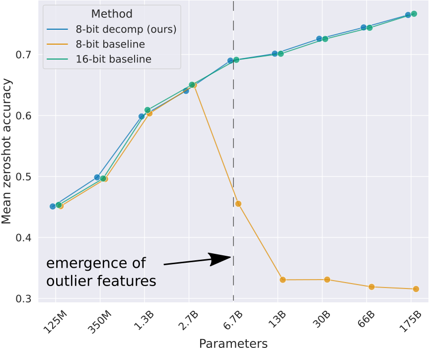
Tim’s blog post explains this extremely well. And in bad news for quantization fans, it turns out that outliers do indeed occur in these models especially as you scale up, leading to major drops in performance after quantization unless you do lots of extra work to address the issue. For example, you can identify groups of parameters that contain most of the outliers and keep these in higher precision (say, 16-bit) while still quantizing the other 99.9% of the network parameters down to 8 bit or less. Still, this is extra work and imposes a performance penalty. If only there were ways to avoid these outliers from occurring…
Existing Fixes
Some researchers at Qualcom (who have a keen interest in making LLMs runnable at the edge) explored this problem in depth and proposed two clever solutions. It was their paper that sparked this whole thing. To summarize their findings:
- Many outliers occur as attention heads try to learn a ‘no-op’ where they don’t modify the residual. They do this by creating a larger and larger input to the softmax, pushing the rest of the values closer to 0 (but thanks to the softmax formulation they never get all the way to 0).
- One fix is to scale and clip the softmax output such that it can saturate and go completely to 0, blocking gradients and preventing the values from growing further. This is the method they call clipped softmax.
- Another option is to add some additional parameters for a learnable gating function, which can control whether the attention output is added in or not. This lets the network learn another way to achieve the so-called ‘no-op’. They call this gated attention.
- Both of their approaches do dramatically reduce the presence of outliers (which they show by measuring the max magnitude of the activations as well as the ‘kurtosis’) and the resulting transformers perform almost as well quantized as they do in full precision, unlike the baseline without their proposed fixes.

This paper is nice in that it gives a very concrete way to think about the problem and to measure how well a particular solution solves it. If your model has less outliers (measured via inf norm and kurtosis) and still performs well after quantization, you’re on the right track!
Evan’s suggestion
Both of the methods above have potential downsides. Clipping can mess with gradients, and gating requires additional parameters. Evan, with his Physics and Economics background, believes there is a simpler fix: modify the softmax operation itself. Softmax is often used in a ‘choose between options’ scenario and gets thrown in a lot whenever ML people want a convenient function whose outputs sum to 1 (great when you want probabilities). In the case of attention, this is not necessarily a desirable property!
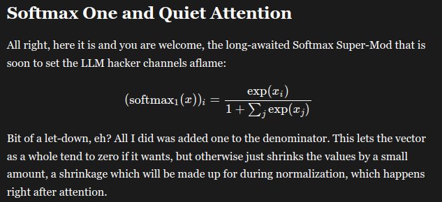
Evan’s suggestion is to effectively add an extra logit that is always set to 0, which means that if the rest go negative the final outputs can all approach zero without the sum needing to be 1. In most cases this function will behave very close to vanilla softmax, but it gives the network an out for when it doesn’t want to have any high outputs. In practice this is implemented by adding 1 to the denominator in the softmax formula. See his post for more details.
Testing it out
Since the change is so small, I cast about for a transformer implementation I could quickly adapt to try this. Karpathy’s nanoGPT is perfect for this kind of thing. Written to facilitate easy learning, a single model.py file to mess with, it was the perfect starting point for experimentation. It turns out I was not the only one to think this, and soon I was in touch with Thomas Capelle (who was using the llama2.c repository that tweaks the nanoGPT code to implement the more recent LlaMa architecture) and with ‘HypnoPump17‘ on Discord who trained two gpt2-small sized models using nanoGPT which were larger than the mini ones I’d been messing with and formed a good starting point for trying to measure the effects of interest.
My first experiments were on very small models (15M parameters). It’s usually good to start small so you can iterate quickly, but in this case this backfired and my results were inconclusive. As noted in Tim’s blog and subsequent work, outliers only start to emerge above 100M parameters and reach some sort of critical threshold only in even larger models (5b+). Luckily, swapping in the 125M parameter models from HypnoPump was and easy change and my quick exploratory notebook showed a marked improvement in inf. norm and kurtosis for the modified softmax, in line with what the Qualcomm authors had observed with their fixes.
The magic of enthusiastic collaborators and outsider insight
While it remains to be seen how impactful this is (see next section), the thing that has really stood out to me so far in this little experiment is how great community research can be. One person with a unique educational background spots a potential new idea, another implements it, a third runs some training runs, a forth analyses the weights, a fifth sets up instrumentation with W&B to track stats during training, someone else starts organising time on a cluster to run some bigger experiments… the productivity of a Discord channel full of enthusiastic hackers is quite something to behold!
Where we are and what comes next?
Amid all this fun the paper authors have been in touch, and have run their own tests of the softmax1 approach, finding that it seems to work about as well as their other proposed fixes. Of course, there’s a lot of work to be done between ‘this maybe works in a quick test’ and something being accepted by the larger community as a technique worth adopting. I expect the next stage involves some larger training runs and more thorough evaluation, hopefully resulting in a paper that presents enough evidence to show the teams currently working on the next generation of LLMs that this is worth paying attention to 😉
Conclusions
This blog post isn’t about the results – we’ll have reports and papers and all that from other people soon enough. At the moment this still has a good chance of ending up in the large and ever-growing bucket of “proposed changes to transformers that never ended up going anywhere”. The reason I’ve written this is instead to share and praise the process, in which open science (teams sharing research on Arxiv), diverse perspectives (Evan writing his post, misc twitter experts chiming in), great tools (Karpathy’s amazing didactic repos, easy experiment tracking and weight sharing) and an active community of hobby researchers all come together to deepen our collective understanding of this magical technology.
Why and how I’m shifting focus to LLMs
While I’ve previously consulted on NLP projects, in the past few years my research focus has been chiefly on images. If you had asked me a few months ago about looking at LLMs, my default response would have been “No way, I bet there are far too many people working on that hyped topic”. But then my research buddies (a crew originally put together by Jeremy Howard to look into diffusion models) switched focus to LLMs, a friend started trying to convince me to join him in starting an LLM-focused company, and I began to re-think my hesitancy. In this blog post, I’ll try to unpack why I’m now excited to shift focus to LLMs, despite my initial misgivings about moving into a crowded market. And then I’ll try to outline how I’ve gone about loading up my brain with relevant research so that I can become a useful contributor in this space as quickly as possible. Here goes!
Part 1: Why LLMs are exciting
The TL;DR of this section is that it turns out there is a lot of innovation happening in this space, and lots of low-hanging fruit available in terms of improvements to be made, all driven by open-source models and the influx of new ideas. For a while, it felt like you needed to be at a big org with tons of compute to research LLM stuff and that OpenAI was just too far ahead for most things. Here are some specific thoughts I wrote out the other day when someone asked what I found exciting:
The explosion of interest in LLMs has led to a flurry of innovations around them. In particular, there are some cool techniques around lower-resource training and inference that I’m excited to see:
– Quantization methods to reduce the VRAM required to train and serve larger models
– Things like GGML for fast inference without any dependencies, optimized for things like Apple hardware and consumer GPUs (see Modular for a direction in which inference gets easy and fast on lots of different hardware)
– Parameter-efficient fine-tuning methods that allow training with much less compute. It’s tricky to fine-tune the smallest GPT-2 model (125M parameters) on Google Colab when not using any tricks, and yet there are notebooks for SFT on Falcon 7B that can be run happily on the free tier thanks to LoRA and 8-bit Adam.
The upshot of all this is that it’s now doable to train variants of these fairly powerful open-source models with a single GPU in very little time and to share the resulting models (or the much smaller LoRA weights) through things like HuggingFace so that anyone can play with them.
I think the next direction where things will rapidly improve is datasets for fine-tuning. We’ve already seen a big leap in quality over the past few months, with more and more chat / instruct datasets being curated. An obvious next step is using existing LLMs to generate better training data, and/or filter existing data.
The evaluation is lagging a little IMO. The open LLM leaderboard is a cool initiative, although it highlights how fragile these benchmarks can be. I’m excited about using LLMs to evaluate other LLMs (even though this can be precarious) and also hoping to see other alternatives emerge – perhaps something equivalent to the PickScore model that is a useful tool for evaluating image generators and is based on crowd-sourced ratings. Actual human ratings are still super important and hard to do well.
Another fun dynamic is just the constant stream of better base models available for fine-tuning as people compete to make ‘The BEST Truly Open Source Model’. Better base models mean better synthetic data, easier fine-tuning, more use-cases unlocked, more data as a result… it’s a nice flywheel of improvement. And since fine-tuning is getting faster and faster, when a great new base model comes out it won’t take long to apply the same dataset+training strategy as you’ve used on whatever current best model you have.
It feels like all these things make it easier than ever to do cool stuff with LLMs, but also that there are a lot of improvements still on the table – a good time to dive in!
PS: Other interesting directions:
- Ways to use multiple models of different sizes to speed up inference for ‘easy’ completions without sacrificing accuracy
- Moving away from RLHF towards something more like Direct Policy Optimization where you still incorporate feedback but without the RL messiness
- I still think very few people have good recipes for fine-tuning models and getting to know a specific model/task well would likely yield some interesting insights
It’s important to be able to iterate quickly for research to be effective, and when testing an idea meant training an LLM for weeks on tons of GPUs I was not excited. But now that we can potentially tune a good open-source base model on a single machine it seems like we might be close to rapid iterations especially if we just focus on the fine-tuning/alignment/tweaking steps or inference-time innovations. “LLMs are having their Stable Diffusion moment”.
Part 2: How the heck would you ‘learn LLMs’?
I’ve been vaguely keeping up-to-date with the field for years – reading the big announcements and maybe skimming the odd paper here and there. But it had mostly been in a ‘wow PaLM seems cool’ style outsider mode, rather than taking in any details of architecture or training that might be needed to actually work with the darn things. So, step one: start catching up on all the cool tricks everyone knows, and seeing what gems are hidden in some lesser-known papers.
The secret sauce for this is our research group. Twice a week we meed at look through papers we find interesting. Often something recent sparks a specific line of inquiry. For example, there was some buzz on Twitter about the “Textbooks are all you need” paper that used synthetic data alongside heavy LLM-assisted filtering of existing training data to train very good small code models. This leads us to look into some prior work (e.g. the TinyStories paper by some of the same authors that tested similar ideas at a smaller scale) which in turn cites other papers which… Before you know it we have a Zotero library with 300+ papers and some ongoing experiments to start building our own intuition for some of the methods we found interesting.
Some specific things I find extremely powerful about this group-study approach:
- Teaching others about something is an extremely good way to learn it, especially if your audience consists of people who can come up with questions to probe deeper and expand your collective understanding
- More people => more chance for ‘aha’ moments where something suddenly clicks, which can then be explained back in a different way. It seems crazy, but we’ve bootstrapped our understanding of some extremely complex topics just by explaining an idea back and forth to each other in different ways until it really makes sense!
- More people => more perspectives with different experiences to draw from. Someone shares a paper on document retrieval, which sparks a memory of a cool contrastive method used in images, which reminds someone of a paper aligning code and language from a few years ago, which brings up a nice benchmark we could use to test our new ideas…
- Practical experiments are great learning tools. Having multiple people tinkering with things or sharing proof-of-concept implementations is another major boost to understanding something.
It’s one thing to load up your brain with tons of papers and techniques, but that on its own isn’t quite enough to make you useful. So, for me, the next step is getting into the weeds with some actual projects. Run some models, try to train a few on some different tasks, dive into some larger projects… A lot of what I’ve done in this phase isn’t particularly new or interesting, but it builds the muscles for later stuff. If you’re bold you could find a way to get paid for this as a consultant, since everyone wants ‘talk to your docs’ bots and such! I have yet to cave in to that particular temptation, but I *AM* writing a book with some chapters devoted to LLMs (with some amazing co-authors to catch any glaring mistakes I make) which I guess is also killing two birds with one stone in terms of learning while (eventually, hypothetically) earning… And soon I may be full-time at the aforementioned LLM-based startup at which point it stops being ‘hacking around in my spare time’ and turns into ‘ML research’ with a proper job title and everything 🙂
Final Thoughts
This is a weird post, mostly me thinking out loud, but I hope you’ve found it interesting! I’ve gone from thinking LLMs are ‘solved and saturated’ to seeing all sorts of opportunities, and tons of ways someone with a novel perspective or a bit of luck can come in and contribute. So, wish me luck 😉
A Recipe for Training Good Generative Models

Generative models are all the rage at the moment, and quality seems to be skyrocketing across the board. In this post, I share what I’m realizing is *the* key recipe that is powering the best models at the moment.
1) Pre-train on LOTS of data
This makes sense – more data = better, right? And so we see language models training on every scrap of text they can find – books, video transcripts, the entire internet. In the text-to-image domain, datasets like LAION contain billions of images, scraped from the web. This stage is necessary if you want your model to have an ‘understanding’ of as many topics as possible.
2) Fine-Tune with HIGH-QUALITY data
After (1), your model can hopefully produce anything. The downside is that it can produce, well, anything! Including badly spelled Reddit rants (for text models), or low-quality PowerPoint screenshots (for image models). For text-to-image models, another aspect of ‘high-quality’ data is image-caption alignment. If captions don’t match images very well, the model will learn to rely less on the prompt when generating. The fix is to continue training on ‘better’ data, to bias the model toward generating the good stuff. You’re not necessarily teaching it much new in this stage – just pushing it towards a subset of the possibilities it could already generate.
For a model like ChatGPT, this step involves manually finding or creating high-quality examples of chat dialogs. For something like Midjourney, it presumably involves collecting a dataset of stunning-looking images and making sure they have good captions (either by filtering out existing captions or by using auto-generated captions). Next time you read about a cool new generative model, keep an eye out for mention of this ‘high-quality fine tune’ step. For example, in this post on the new Kandinsky 2.1 text-to-image model, they note that after training on a large dataset “Further, at the stage of fine-tuning, a dataset of 2M very high-quality high-resolution images with descriptions … was used separately collected from open sources.”
3) Incorporate HUMAN FEEDBACK
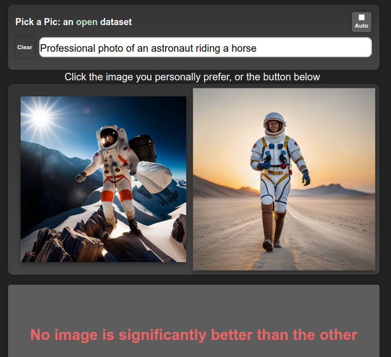

(1), or maybe (1) + (2), will get you great results on automatic evaluations and benchmarks, and may be enough for getting a publication with a SOTA result. However, successful products require pleasing users, so making sure the model creates things that users like is a big deal. Midjourney is a great example – they’ve been collecting user feedback since day 1, and presumably using said feedback to improve their models. Apart from explicit ratings, there are also other ways to get user feedback – for example, when a user selects one of four possible images to download or upscale they provide a signal that can be used to estimate their preference:
The exact method for incorporating this feedback varies. For text, the standard approach is to do something called “Reinforcement Learning from Human Feedback” (RLHF) where a large number of human-labeled outputs are used to train a ‘reward model’ that scores a given generation. This model is then used to train the generative model, evaluating its outputs and providing a signal which is then used to update the model such that it produces better ones according to the reward model. You could also use this kind of preference model to filter out low-quality data (feeding back into (2)) or to condition your model on quality, such that at inference time you can simply ask for 10/10 generations! Whatever the method used, this final stage is once again not teaching the model anything new but is instead ‘aligning’ the model such that its outputs more often look like something humans will like.
‘Cheating’
OpenAI spent tons of money and compute doing their supervised fine-tuning and RLHF magic to create ChatGPT and friends. Facebook released a research preview of LLaMa, a family of models trained on more than a billion tokens. The LlaMa models have only had step (1) applied, and aren’t great out-of-the-box for chat applications. Then along come various groups with access to OpenAI’s models via API, who created a training dataset based on ChatGPT outputs. It turns out that fine-tuning LlaMa on this data is a quick way to get a high-quality chatbot! A similar dynamic is playing out with various open-source models being trained on Midjourney outputs. By copy-catting powerful models, it is possible to skip (2) and (3) to a large extent, leaving the companies investing so much in their models in an interesting position. It will be interesting to see how this plays out going forward…
Conclusions
This recipe isn’t necessarily new. The ULMFiT paper from Jeremy Howard and Sebastian Ruder in 2018 did something similar, where they pre-train a language model on a large dataset (1), fine-tune it on industry-specific data (2), and then re-train for a specific task such as classification. That said, I feel like this year we’re seeing it really pay dividends as apps like ChatGPT reach hundreds of millions of people and companies scramble to offer free access to powerful models in exchange for that all-important user preference data. Excitingly, there are open-source efforts to collect the necessary data too – see the PickAPic effort (for images) or the Open Assistant project (for chat data) among many others. And open source models such as stable diffusion let others skip the expensive pre-training phase and move straight to fine-tuning, lowering the barrier to entry substantially.
PS: Who’s Feedback?

Something worth mentioning (thanks @LuciaCKun for highlighting this) is that using human feedback has some ethical considerations. It could be that a small set of people (employees of a company, or early testers) get to spend time telling a model “This is good, that is bad”, and their biases end up defining the behavior of the model for everyone. You see this with images – anything trained on early user preferences for text-to-image models is likely to skew toward fantasy women and art-station aesthetics. Finding ways to align with different people’s values rather than locking in a specific behavior is an active area of research, in which there is plenty of work left to do.
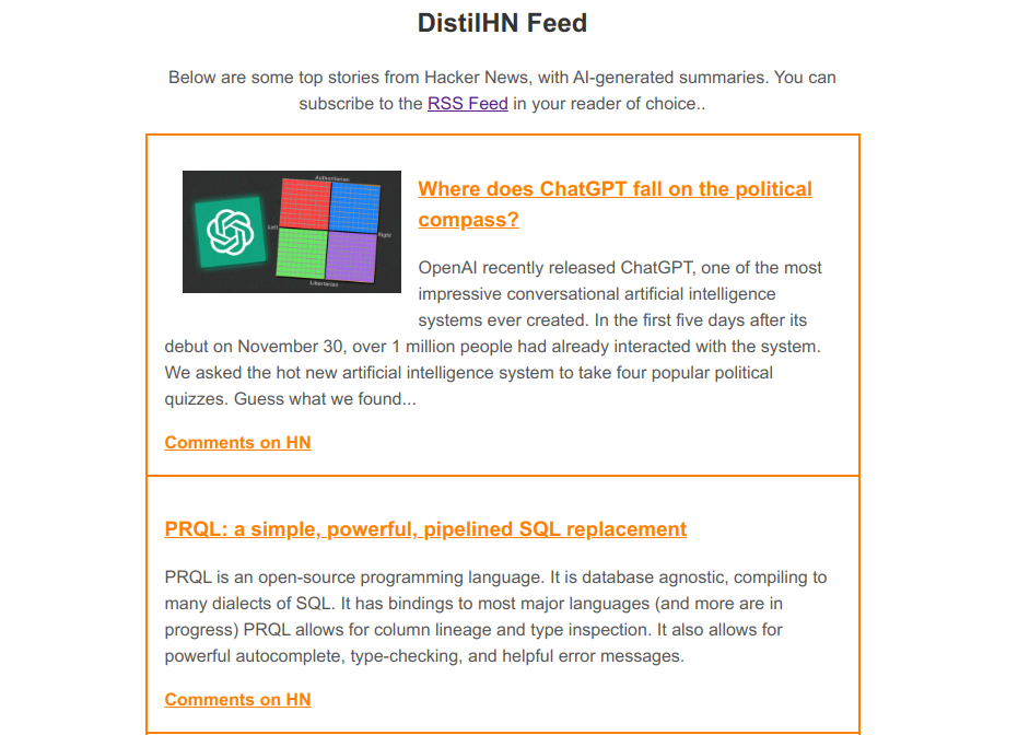
DistilHN: Summarizing News Articles with Transformers

In this series, I’d like to explore how to take an idea within machine learning from proof of concept to production. This first post is going to get things going with a little mini-project that I did in the downtime between Christmas activities, creating a website called DistilHN.com using a bit of machine learning magic and some basic web scraping. Let’s get started.
The Idea
I’ve been thinking about how to make a better news feed. When confronted with a clickbait headline, I often want a little more info, but don’t feel like clicking through to the article (and dismissing the cookie popup, and scrolling past the ads, and declining their invite to sign up for the newsletter, and …) just to see what it’s about. So, this is the idea: use AI to generate a short summary that you can read before deciding whether you’re going to commit to the full article or just skip straight to the comments section on Hacker News.
Scraping Text
I started working on a way to get the main text from an arbitrary website using Beautiful Soup, writing heuristics for which elements were worth including or ignoring. It turns out this is a very hard problem! After a while I had something that sort of worked for some sites, but in desperation I decided to take another look around online to see if someone else had already done the hard work.
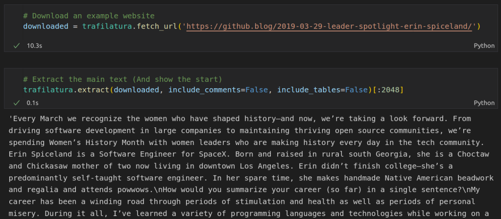
Enter the Trafilatura library, purpose-built for this exact task! It makes it super easy to grab the text from any website, as shown in the screenshot above. Aside: all the code shown in this post is also available as a notebook on Google Colab here.
Summarization
For the actual summarization step, I choose to use this model from Facebook which was fine-tuned for news article summarization. You can run it locally with a huggingface pipeline, but I chose to use the free inference API since we’re not going to need to run this thousands of times an hour and we may as well do as little work as possible ourselves! We set up a query, specify the text we want to summarize and the min and max length for the summary, post the request and wait for the summary back.
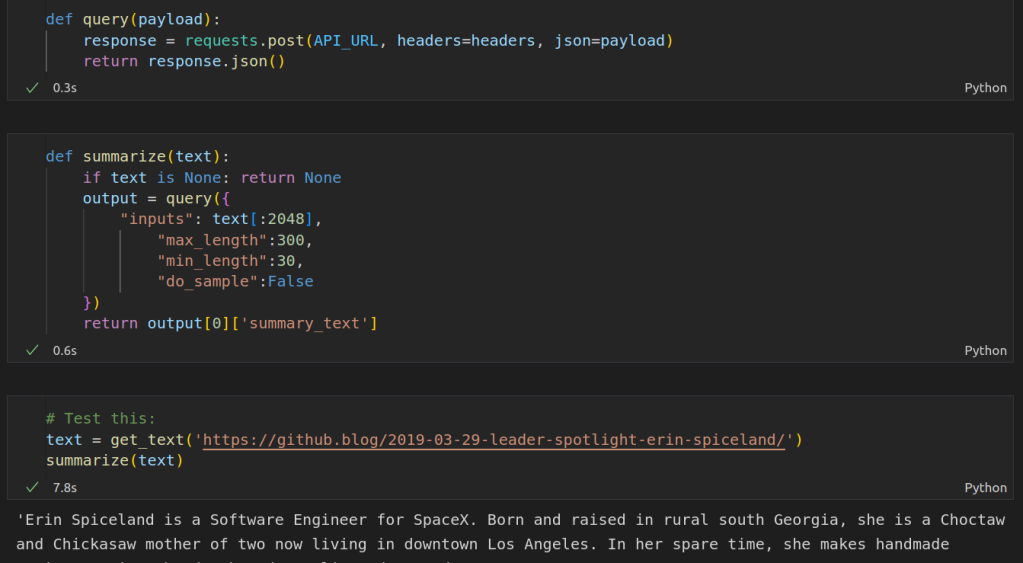
This was a bit of a revelation for me. In the past I’d be downloading and training models as soon as I started a project like this, but here is an existing solution that does the job perfectly. If we want to scale up, Huggingface has paid inference options or we can switch to running the model ourselves. But for this proof-of-concept, the inference API makes our lives easy 🙂
Sharing
It’s one thing to run something like this once in a notebook. To make this a permanent solution, we need a few things:
- Some server to run a script every hour or so to fetch and summarize the latest articles.
- A website or something so that we can share our project with others, including a place to host it
- Ideally, an RSS feed that users can read from their RSS app of choice.
I decided to start by wrapping up the scraping and summarization code into a script and having it write the results to an RSS feed (using the feedgenerator Python library). This way I’d have the content in a known format and a useable output before I start hacking on the front end.
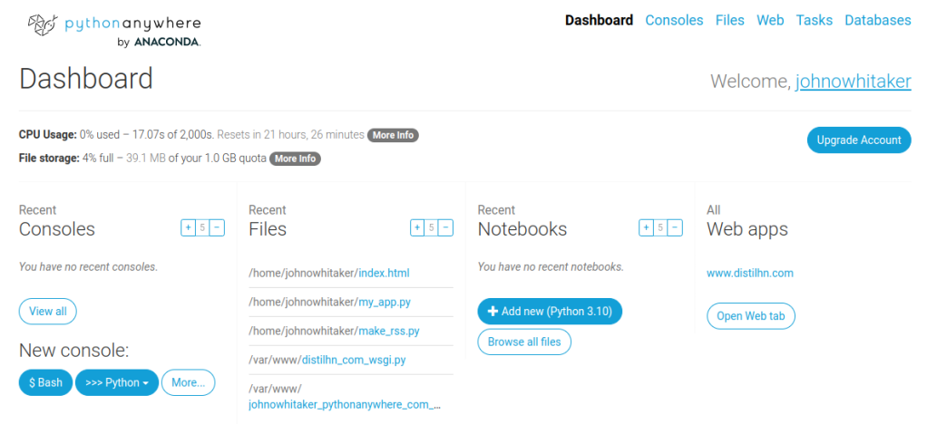
While you could host something like this yourself on a small VPS, I chose to go the easy route and use a website called PythonAnywhere which handles some of the admin for you. They have a tutorial for hosting a static site and make it easy to upload files like the aforementioned script and set them to run on a schedule. I did end up making a minimal flask app too in case I want to develop this further, but for the initial demo, I just exposed the index.html and feed.xml files to the web via the PythonAnywhere web UI. This is great for getting demos up quickly, and since this is just serving a static site it should scale extremely well.
Speaking of index.html, I made a simple HTML page and modified a Javascript snippet from this tutorial to load in the items from the RSS feed and add them to the page. I’m not particularly comfortable with HTML/CSS so styling this took ages, and it still looks a little clunky. ChatGPT and GitHub CoPilot turned out SUPER useful for this step – I find myself relying on CoPilot’s suggestions much more when working with languages that I am less familiar with, and being able to just type /* Make the image appear at the top, centered */ and then hit tab to get the CSS I needed for something is delightful compared to my usual fiddle->test->google->repeat cycle.
Taking This Further
You can see the final website at https://www.distilhn.com/. I’m quite pleased with how it turned out, even if there are still a few things to iron out. I’m already working on a more ambitious follow-on project, pulling news from across the globe and filtering it using more ML magic… but that will have to wait for a future post 🙂 Until then, have fun with the website, and let me know if you have ideas for improvements! Happy hacking.
How Predictable: Evaluating Song Lyrics with Language Models

I was briefly nerd-sniped this morning by the following tweet:
Can we quantify how ‘predictable’ a set of lyrics are?
Language Models and Token Probabilities
A language model is a neural network trained to predict the next token in a sequence. Specifically, given an input sequence it outputs a probability for each token in its vocabulary. So, given the phrase “Today is a nice ” the model outputs one value for every token, and we can look up the probability associated with the token for “day” – which will likely be fairly high (~0.5 in my tests).
We can look at the probabilities predicted for each successive word in a set of lyrics, and take the average as a measure of ‘predictability’. Here’s the full code I used:
import torch
from transformers import AutoModelForCausalLM
from transformers import AutoTokenizer
gpt2 = AutoModelForCausalLM.from_pretrained("gpt2", return_dict_in_generate=True)
tokenizer = AutoTokenizer.from_pretrained("gpt2")

lyrics = """
    And my thoughts stay runnin', runnin' (Runnin')
    The heartbreaks keep comin', comin' (Comin')
    Oh, somebody tell me that I'll be okay
"""
input_ids = tokenizer(lyrics, return_tensors="pt").input_ids
word_probs = []
min_length = 5 # How much do we give to start with

for i in range(min_length, len(input_ids[0])-1):
    ids = input_ids[:,:i]
    with torch.no_grad():
        generated_outputs = gpt2.generate(ids[:,:-1], do_sample=True, output_scores=True,
                                          max_new_tokens=1,
                                          pad_token_id=tokenizer.eos_token_id)
    scores = generated_outputs.scores[0]
    probs = scores.softmax(-1)
    word_probs.append(probs[0][ids[0][-1]])

torch.mean(torch.tensor(word_probs))
My starting point was this post by Patrick Von Platen showing how to generate probabilities per token with GPT-2.
Results
The first test: ‘Remind Me’ by Megan Trainor. The mean probability given by the model for the next word given the lyrics up to that point: 0.58!
Trying a few other songs I could think of with less repetitive lyrics:
- ‘Levitate’ (21 Pilots): 0.34
- ‘Mom’s Spaghetti’ (MNM): 0.35
- The code example above: 0.45
- I’m Gonna Be (500 Miles)’ (The Proclaimers): 0.59
There is a caveat worth making which is that anything written before 2019 might be in the model’s training data, and so it might ‘know’ the lyrics already making the measure less informative.
Historical Trends
EDIT: Someone (me) didn’t preview their data well enough, the lyrics I used for this were either badly scraped or very processed, so these scores won’t compare well to the previous section and I need to re-do this with a proper dataset before we can say anything concrete about trends!
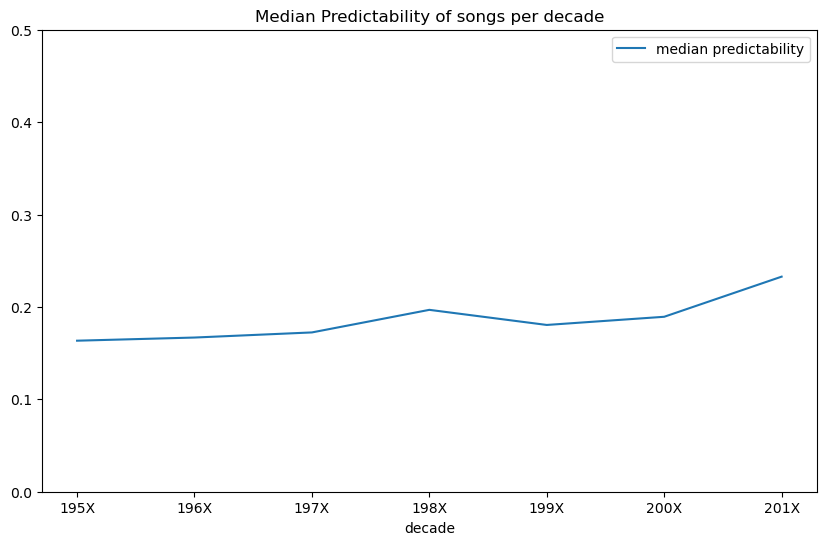
I downloaded a bunch of song lyrics via this dataset and sampled some from different years (1950 – 2019). For each, I estimated the predictability as described above. I found very little correlation (correlation coefficient 0.037 EDIT: 0.06 with a larger sample size) between predictability and year released, but there does seem to be a slight uptick in median predictability over time, especially going into the 2010s, which I’m sure will validate those grumbling about ‘music these days’…
Conclusion
This was fun! Go play with the code and see if your least favourite song is actually as predictable as you think it is. Or perhaps run it over the top 100 current hits and see which is best. I should get back to work now, but I hope you’ve enjoyed this little diversion 🙂
Update Time
A few recent projects I’ve worked on have been documented elsewhere but haven’t made it to this blog. The point of this post is to summarize these so that they aren’t lost in the internet void.
AI Art Course
Part 2 of AIAIART launched last month. You can see all lessons and a link to the YouTube playlist here: https://github.com/johnowhitaker/aiaiart
- Lesson 5 – Recap of key ideas and start of part 2: https://colab.research.google.com/drive/1cFqAHB_EQqDh0OHCIpikpQ04yzsjITXt?usp=sharing
- Lesson 6 – Transformers for image synthesis and VQ-GAN revisited: https://colab.research.google.com/drive/1VhiIxMw9YClzmwamu9oiBewhZPnhmSV-?usp=sharing
- Lesson 7 – Diffusion Models: https://colab.research.google.com/drive/1NFxjNI-UIR7Ku0KERmv7Yb_586vHQW43?usp=sharing
- Lesson 8 – Neural Cellular Automata: https://colab.research.google.com/drive/1Qpx_4wWXoiwTRTCAP1ohpoPGwDIrp9z-?usp=sharing
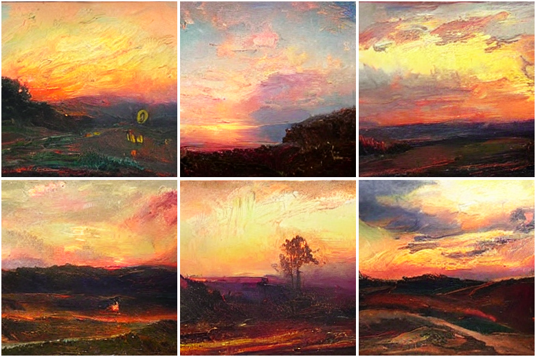
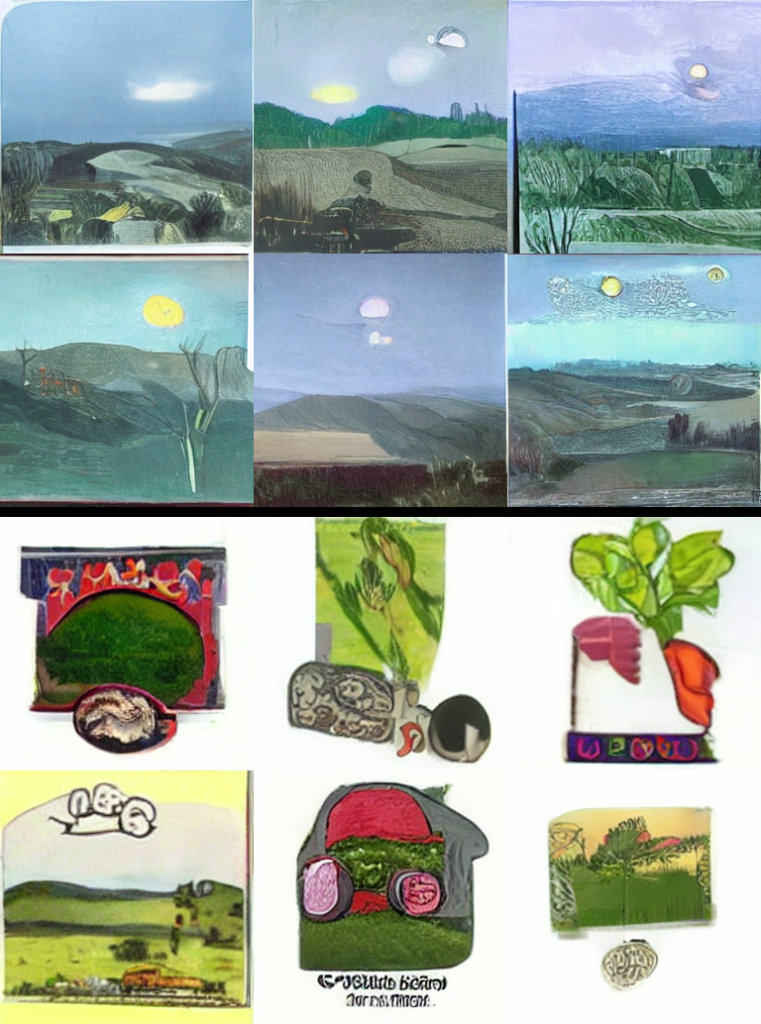
Image Generation with CLOOB Conditioned Latent Denoising Diffusion GANs

I had fun trying out a new(ish) approach for text-to-image tasks. The neat thing with conditioning on CLOOB embeddings is that you can train without text captions and still get some text guidance ability at inference time (see image above). This got written up as a nice report on Weights and Biases.
Getting Started with the Microsoft Rice Disease Classification Challenge
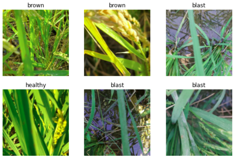
An intro to the latest Zindi challenge with starter code and some thoughts on experiment tracking. You may see more of this at some point – for now, you can read the report here.
Fun with Neural Cellular Automata
Building on lesson 8 of the course, this project involved training various neural cellular automata and figuring out how to make them do tricks like taking a video as a driving signal. I’m particularly pleased with the W&B report for this – I logged interactive HTML previews of the NCAs as shaders as they train, and tracked just about everything during the experiments. I also made a Gradio demo that you can try out right now.
Huggan Projects

We trained some GANs on butterflies! Have fun with the demo space. I also did a similar version with AI-generated orbs as the training data. I love how easy it is to get a demo running with HF spaces + gradio. Feels like cheating!
Fine-tuning a CLOOB-Conditioned Latent Diffusion Model on WikiArt
As part of the Huggingface ‘#huggan’ event, I thought it would be interesting to fine-tune a latent diffusion model on the WikiArt dataset, which (as the name suggests) consists of paintings in various genres and styles.
What is CLOOB-Conditioned Latent Diffusion?
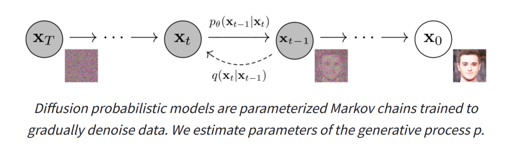
Diffusion models are getting a lot of fame at the moment thanks to GLIDE and DALL-E 2 which have recently rocked the internet with their astounding text-to-image capabilities. They are trained by gradually adding noise to an input image over a series of steps, and having the network predict how to ‘undo’ this process. If we start from pure noise and have the network progressively try to ‘fix’ the image we eventually end up with a nice looking output (if all is working well).
To add text-to-image capacity to these models, they are often ‘conditioned’ on some representation of the captions that go along with the images. That is, in addition to seeing a noisy image, they also get an encoding of the text describing the image to help in the de-noising step. Starting from noise again but this time giving a description of the desired output image as the text conditioning ideally steers the network towards generating an image that matches the description.
Downsides: these diffusion models are computationally intensive to train, and require images with text labels. Latent diffusion models reduce the computational requirements by doing the denoising in the latent space of an autoencoder rather than on images directly. And since CLOOB maps both images and text to the same space, we can substitute the CLOOB encodings of the image itself in place of actual caption encodings if we want to train with unlabelled images. A neat trick if you ask me!
The best non-closed text-to-image implementation at the moment is probably the latent diffusion model trained by the CompVis team, which you can try out here.
Training/Fine-Tuning a model
@JDP provides training code for CLOOB conditioned latent diffusion (https://github.com/JD-P/cloob-latent-diffusion) based on the similar CLIP conditioned diffusion trained by Katherine Crowson (https://github.com/crowsonkb/v-diffusion-pytorch). One of my #huggan team members, Théo Gigant, uploaded the WikiArt dataset to the huggingface hub, and the images were downloaded, resized and saved to a directory on a 2xA6000 GPU machine provided by Paperspace.
After a few false starts figuring out model loading and other little quirks, we did a ~12 hour training run and logged the results using Weights and Biases. You can view demo outputs from the model as it trains in the report, which thanks to the W&B magic showed them live as the model was training, making for exciting viewing among our team 🙂
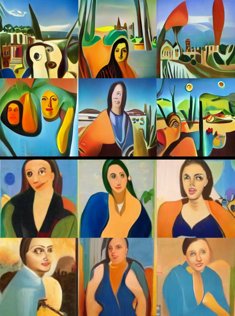
Evaluating The Resulting Model
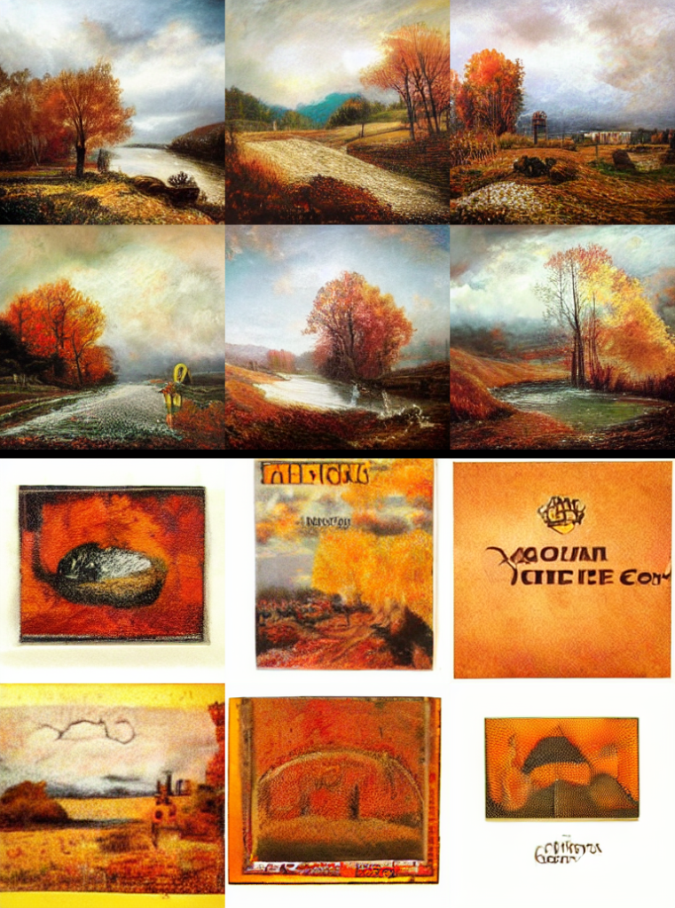
WikiArt is not a huge dataset relative to the model (which has over a billion parameters). One of the main things we were curious about was how the resulting model would be different from the one we started with, which was trained on a much larger and more diverse set of images. Has it ‘overfit’ to the point of being unuseable? How much more ‘arty’ do the results look when passing descriptions that don’t necessarily suggest fine art? And has fine-tuning on a relatively ‘clean’ dataset lowered the ability of the model to produce disturbing outputs? To answer these questions, we generated hundreds of images with both models.

I’ve moved the side-by-side comparisons to a gallery at the end of this post. These were the key takeaways for me:
- Starting from a ‘photorealistic’ autoencoder didn’t stop it from making very painterly outputs. This was useful – we thought we might have to train our own autoencoder first as well.
- The type of output definitely shifted, almost everything it makes looks like a painting
- It lost a lot of more general concepts but does really well with styles/artists/image types present in the dataset. So landscape paintings are great, but ‘a frog’ is not going to give anything recognizable and ‘an avocado armchair’ is a complete fail 🙂
- It may have over-fit, and this seems to have made it much less likely to generate disturbing content (at the expense of also being bad at a lot of other content types).
Closing Thoughts
Approaches like CLOOB-Conditioned Latent Diffusion are bringing down the barrier to entry and making it possible for individuals or small organisations to have a crack at training diffusion models without $$$ of compute.
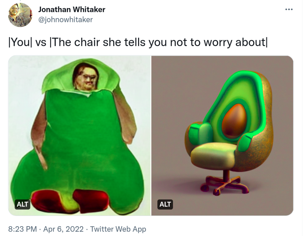
This little experiment of ours has shown that it is possible to train one of these models on a relatively small dataset and end up with something that can create pleasing outputs, even if it can’t quite manage an avocado armchair. And as a bonus, it’s domain-focused enough that I’m happily sharing a live demo that anyone can play with online, without worrying that it’ll be used to generate any highly-realistic fake photographs of celebrity nudity or other such nonsense. What a time to be alive!
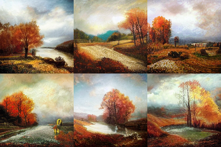
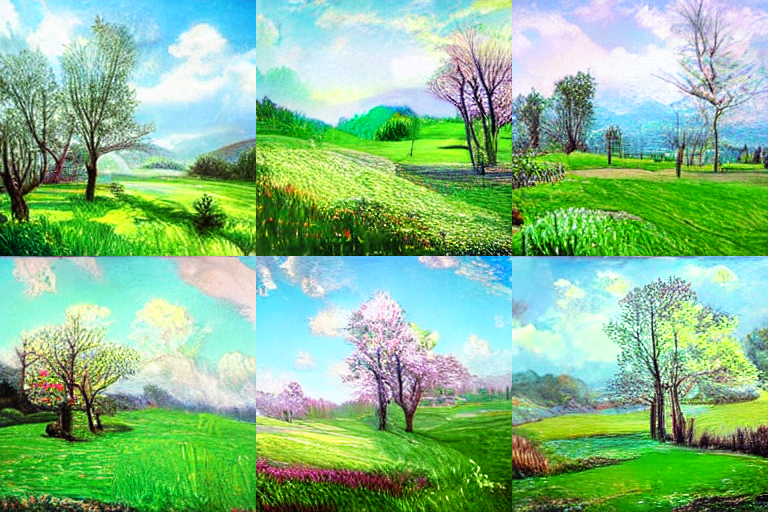
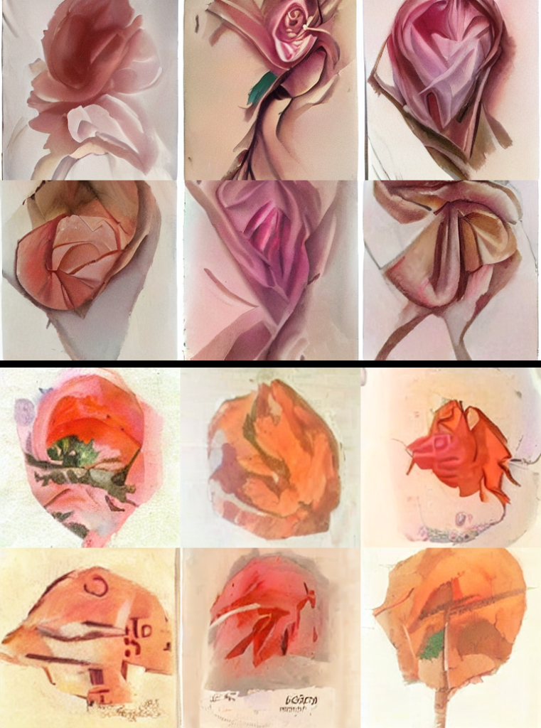
Comparison images


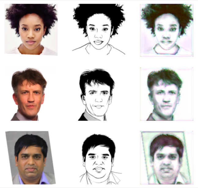
Sketchy Unet
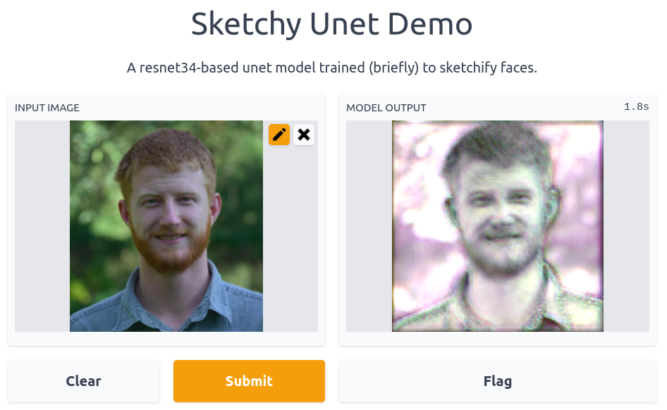
I wanted a fast way to go from an image to something like a rough charcoal sketch. This would be the first step in a longer pipeline that would later add detail and colour, so all it has to do is give a starting point with the right sort of proportions.
Finding a dataset
I found a small dataset that seemed like a good starting point (originally created in ‘APDrawingGAN: Generating Artistic Portrait Drawings From Face Photos With Hierarchical GANs‘ by Ran Yi, Yong-Jin Liu, Yu-Kun Lai, Paul L. Rosin). It’s quick to download, and (with a little datablock wrangling) easy enough to load with fastai. See the notebook for details.
Training the model
I chose to model this as an image-to-image task, and used fastai’s unet_learner function to create a U-net style network based on a Resnet34 backbone. Starting with 128px images and then moving up to 224px, the model is trained to minimise the MSE between the output and the reference sketch. In about 3 minutes (!!) we end up with a model that is doing pretty much exactly what I want:
Sharing a Demo
I’ve been playing around with HuggingFace Spaces recently, and this model was a great candidate for a simple demo that should run reasonably fast even on a CPU (like those provided by Spaces). At the end of the training notebook you can see the gradio interface code. Very user-friendly for these quick demos! The trained model was uploaded to huggingface as well, and they somehow detected that my code was downloading it because it shows up as a ‘linked model’ from the space.
It’s neat that I can so easily share everything related to a mini-project like this for others to follow along. The colab notebook provides a free cloud environment to replicate training, the model is hosted by someone with lots of bandwidth and is easy to download, and the demo needs no technical skills and lets anyone try it out in seconds. Hooray for fastai, gradio, huggingface and so many others who work so hard to make our lives easy 🙂
Update: What’s this for?
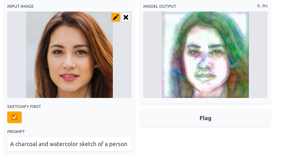
I used this model to ‘sketchify’ images before loading them into an imstack and optimising that to match a CLOOB prompt like ‘A charcoal and watercolor sketch of a person’. After a few steps the result looks pretty OR more likely a little creepy. Ah, the power of AI 🙂 Try it out here.
Turtle Recall: A Contrastive Learning Approach
NB: A scoring glitch caused this approach to look very good on the leaderboard, but local validation and a fix from Zindi later confirmed that it isn’t as magical as it first seemed. Still interesting from an educational point of view but if you’re looking to compete I’d suggest investigating alternate strategies.
Introduction
Zindi has a competition running to identify individual turtles based on images from different views. This presents an interesting challenge for a few reasons:
1) There are relatively few images per turtle (10-50 each) and these have been taken from multiple angles. Given how similar they are, simply treating this as a normal multi-class classification challenge is hard.
2) There is an emphasis on generalization – it would be great if the organizations involved could add additional turtles without expensive re-training of models.
One potential approach that should help address these problems is to learn useful representations – some way to encode an image in a meaningful way such that the representations of images of one individual are all ‘similar’ by some measure while at the same time being dissimilar to the representations of images from other individuals. If we can pull this off, then given a new image we can encode it and compare the resulting representation with those of all known turtle images. This gives a ranked list of the most likely matches as well as a similarity score that could tell us if we’re looking at a completely new turtle.
To keep this post light on code, I have more info and a working example in this colab notebook. I’m also working on a video and will update this post once that’s done. And a modified version of this might be posted on Zindi learn, which again will be linked here once it’s up.
Contrastive Learning
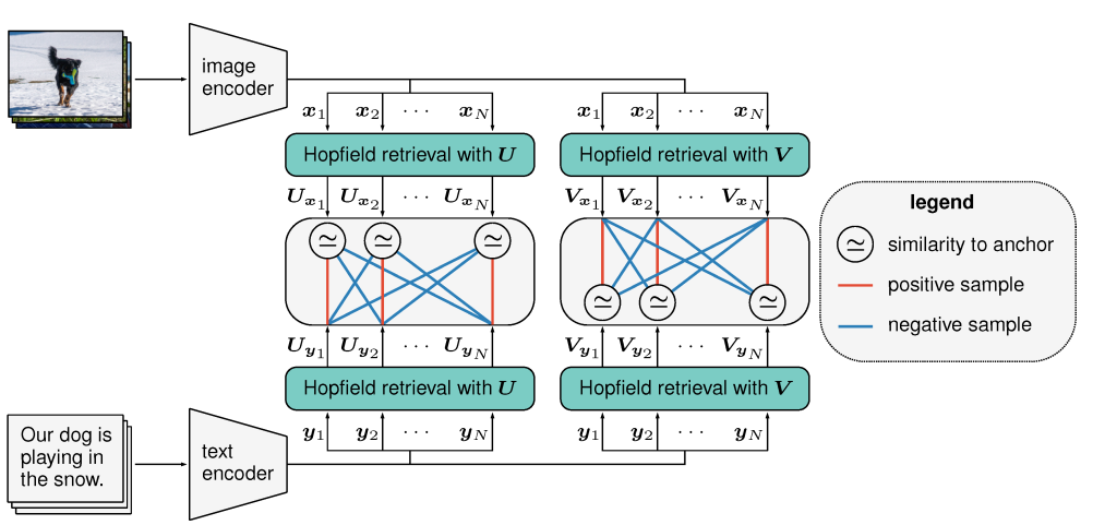
The goal of contrastive learning is to learn these useful representations in an unsupervised or loosely-supervised fashion (aka self-supervised learning). A typical approach is to take some images, create augmented versions of those images and then embed both the originals and the augmented versions with some encoder network. The objective is to maximise the similarity between an image and its augmented version while minimising the similarity between that image and all the rest of the images in the batch. The trick here is that augmentation is used to create two ‘versions’ of an image. In our turtle case, we also have pictures of the same individual from different angles which can be used in place of (or in addition to) image augmentations to get multiple versions depicting one individual.

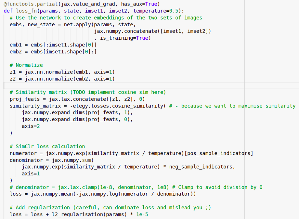
In my implementation, we generate a batch by picking batch_size turtles and then creating two sets of images with different pictures of those turtles. A resnet50 backbone acts like the encoder and is used to create embeddings of all of these images. We use a contrastive loss function to calculate a loss and update the network weights.
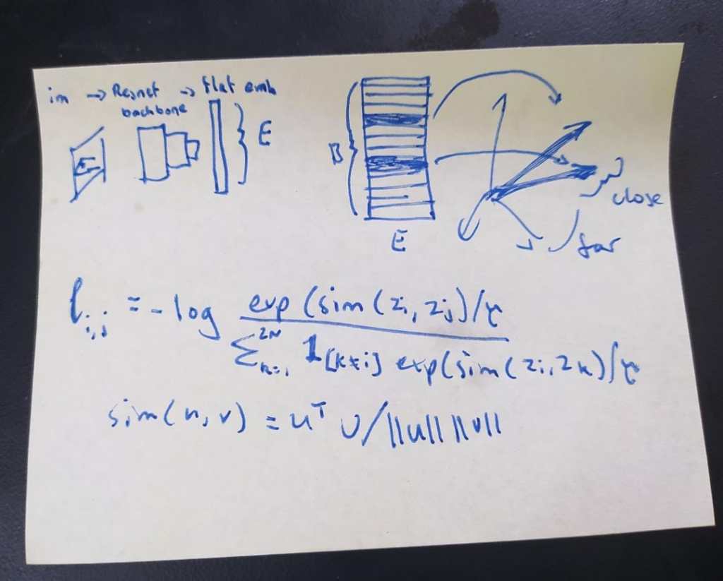
You can check the notebook or the video for more details on the implementation here. Once all the bugs were ironed out, the training loop runs and the loss shrinks nicely over time. But the question arises: how do we tell if the representations being learnt are actually useful?
Key reference for going deeper: SimCLR – A Simple Framework for Contrastive Learning of Visual Representations
Representational Similarity Matrices
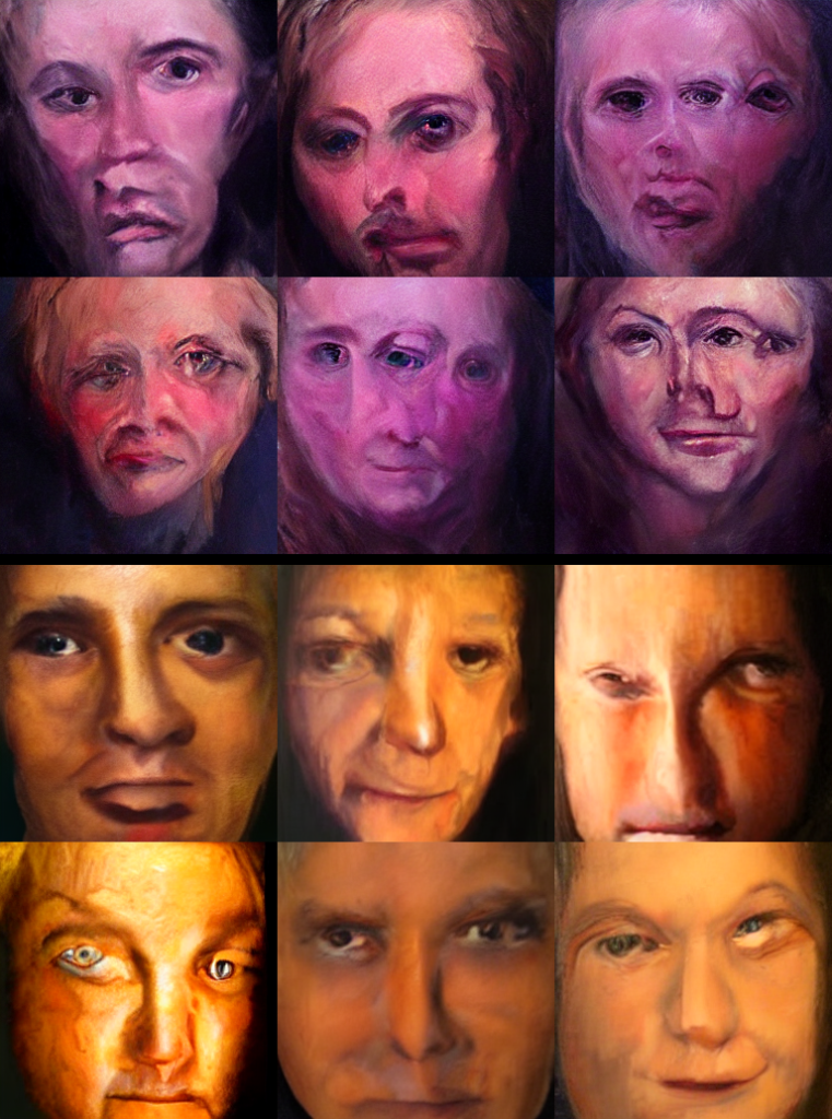
Remember, our end goal is to be able to tell which individual turtle is in a new image. If things are working well, we’ll feed the new image through our encoder model to get a representation and then compare that to the encoded representations of the known turtles. All pictures of a given individual should be ‘similar’ in this space, but should not be similar to images of other individuals. A neat way to visualize this is through something called a Representational Similarity matrix. We take, say, 16 images of 5 different turtles. We embed them all and compute all possible pair-wise similarities and then plot them as a heatmap:
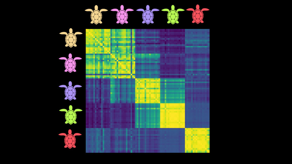
The images are obviously identical to themselves – hence the thin bright diagonal. But here you can also see that images of a given turtle seem to be similar to others of that same turtle – for instance, the bottom right 16×16 square shows that all images of the red turtle are quite similar to each other. This also shows us which turtles might be regularly confused (pink and yellow for eg) and which are relatively easy to disambiguate (pink and green).
RSMs are a useful tool for quickly getting a feel for the kind of representations being learnt, and I think more people should use them to add visual feedback when working on this kind of model. Looking at RSMs for images in the training set vs a validation set, or for different views, can shed more light on how everything is working. Of course, they don’t tell the whole story and we should still do some other evaluations on a validation set.
So does it work?
I trained a model on a few hundred batches with an embedding size of 100. For the test set, I took the turtle_ids of the most similar images in the training set to each test image and used those as the submission. If there were no images with a similarity above 0.8 I added ‘new_turtle’ as the first guess. This scores ~0.4 in local testing and ~0.36 on the public leaderboard. This is pretty good considering we ignored the image_position label, the label balance and various flaws in the data! However, a classification-based baseline with FastAI scores ~0.6 and the top entries are shockingly close to perfect with mapk scores >0.98 so we have a way to go before this is competitive.
One benefit of our approach: adding a new turtle to the database doesn’t require re-training. Instead, we simply encode any images of that individual we have and add the embeddings to the list of possible matches we’ll use when trying to ID new images.
Where Next?
There are many ways to improve on this:
- Experiment with parameters such as embedding size, batch size, augmentation types, training approach, regularization etc.
- Incorporate the image_position labels, either doing separate models for different angles, filtering potential matches based on the test labels or finding some way to feed the label into the model as an extra type of conditioning.
- Experiment with fine-tuning the model on the classification task. Since it has now (theoretically) learnt good representations, we could likely fine-tune it with a classification loss and get even better competition performance (at the cost of lower genaralizability)
- Explore automated data cleaning. Some images are out-of-domain, showing random background as opposed to turtle faces . Some images are just bad quality, or just don’t work with center-cropping.
- Try different models as the backbone
- Investigate label balance
…And many more. I hope this post gets you excited about the competition! Feel free to copy and adapt the notebook (with attribution please) and let me know if you manage to make any improvements. See you on the leaderboard 🙂
