Tutorial: Predicting Crop Types with GEE

Attempting Zindi’s Farm Pin Crop Detection Challenge Without Downloading any Imagery

Zindi is currently hosting a competition to classify fields by crop type using Sentinel-2 satellite imagery. They provide labeled fields with the crop type, and a separate set of fields as the ‘test’ set. The goal is to use the provided imagery to predict the crop type as accurately as possible. It’s a great contest, BUT: The imagery files are huge (although they offer Azure credits to help mitigate this by using cloud computing), and extending such an analysis to other areas is not easy. The goal of this post is to show how we can use the labeled fields to train our own classifier in Google Earth Engine (GEE), using Landsat imagery for the classification (EDIT: Sentinel 2 imagery is also available in GEE, making this choice somewhat arbitrary). This results in a model that can be applied over any region, and is a process that could be replicated by anyone with some known crop fields and an internet connection.

I won’t include all the code here. Instead, view it and try it for yourself here.

The Training Data

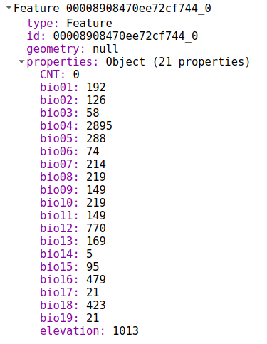
The important data is contained in a shapefile (a mapping-related file format for ‘vector’ layers that can contain points, lines or polygons). It contains multiple features (polygons), each representing a field with a certain kind of crop. The crop type is encoded as a number from 1 to 10. More info here.

Some features in the ‘train’ shapefile.

We can upload this data as an asset in GEE by using the ‘New Table Upload’ option and selecting all the files except train.qpj (which is unnecessary). I named the asset ‘farm_zindi_train’, and repeated the steps for the test dataset.

There is one last hurdle we must overcome when using this data to train classifiers in GEE. Each feature in the training shapefile contains a property, ‘Crop_Id_Ne’, that tells us the crop type. Unfortunately, this is represented as a string. To convert it to the required type, we create a function that is mapped over the feature collection and use ee.Number.parse() to convert the string into a number for the model to use.

Getting the required properties in the correct type by mapping a function over the collection

Landsat Imagery

Instead of the Sentinel-2 imagery the competition is using, we’ll see if we can achieve the same results with freely available Landsat 8 imagery. I used code from this tutorial to load the landsat data and create a ‘greenest pixel composite’ based on a computed value called NDVI (normalized difference vegetation index). This is not an ideal approach – we could instead have chosen a time of year when the differences between crops are most obvious, or used multiple images from different times in the growing season. These improvements will be considered in a future tutorial.

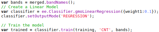
Training A Classifier

The ‘Supervised Classification’ guide by Google is good place to start when attempting this kind of classification task. The only changes I made to the provided code was to change the references to match my own training data, tweak the scale to reduce memory use and specify the property we’re trying to predict (in our case, ‘CID’ for crop ID). Looking at the output, it seems to roughly match the farm outlines – a good sign.

Classifier output with farm boundaries shown.

Comparing Classification Accuracy

Ideally, we’d split the data into training and test sets, compare different classifiers and pick the best. We might even keep a third set of data, the ‘validation’ set, to get a better idea of how our chosen classifier will perform on unseen data. As with the different options for input layers, I’ll leave this for a second tutorial. For now, we will be lazy and evaluate the accuracy on the training data: print(‘Accuuracy’, trained.confusionMatrix().accuracy());

The accuracy of a CART classifier is listed as 65%. Not bad, given that there are 10 classes, but not great either. Switching to a random forest model gives a much higher accuracy score, but may be subject to overfitting.

Exporting Predictions

To get the predicted crop type in each region of the test file, we look at the most common crop type predicted by the classifier in each region and export the predictions to a CSV file:

Exporting predictions

This results in a file containing columns for Field_Id and predicted crop type. Normally, this is what we’d like. However, the Zindi contest specifies the submission with predicted probabilities for each different crop:

The submission format

To get the data in this format, I used Python and pandas, with the pandas get_dummies function:

Formatting the data correctly

This is not ideal – we see a 1 for our predicted class, with 0s for the rest. It would be better to predict the probabilities and hedge our bets, but let’s see see how this does. predictions.to_csv('pred_test_cart.csv', index=False) gives a file we can upload on Zindi… And the final score? ~17.4 (or ~15 with the random forest model), putting this submission in 30th place out of 31 entries as of today.

Future Improvements

There are many ways we could improve this score. A different classifier might perform better. Selecting the greenest pixels was probably not the best approach. Instead of using ee.Reducer.mode(), we could count how many pixels are predicted for each crop type and use those counts to assign probabilities for our submission. Etc Etc. Some of these improvements will be covered in a future tutorial, hopefully coming soon.

Conclusions

Despite our lackluster score, this exercise has hopefully shown the possibilities of this approach. Using only freely available imagery, which we never had to download thanks to Google Earth Engine, we were able to make predictions about which crops were being grown in different fields. If you’ve followed along, I hope you’ve seen what is possible with GEE – simply by copying snippets of code and gluing them all together. Once the accuracy is improved, this technique could be applied in many different situations.

Mapping Baobabs, Part 3 – Model Applicability

In the previous two posts, we built a Species Distribution Model and used it to predict the density of Baobab trees in Zimbabwe. Then we tried some more complex models, trained a decision tree regressor and imported it into Google Earth Engine. We showed various metrics of how well a model does, but ended with an open question: how to we tell how well the model will do when looking at a completely new area? This is the subject we’ll tackle in today’s post.

The key concept here is distance from the sample space. We sampled at a limited number of geographic locations, but there is no way these locations completely cover all possible combinations of temperature, rainfall, soil type and altitude. For example, all samples were at altitudes between 300 and 1300m above sea level. We might expect a model to make reasonable predictions for a new point at 500m above sea level. But what about a point at 290m elevation? Or 2000m? Or sea level? Fitting a linear model based purely on altitude, we see the problem clearly:

Line of best fit: Elevation vs Density

Negative tree densities at high altitude? Insanely high densities at sea level? Clearly, extrapolating beyond our sample space is risky. Incidentally, if it looks to you like there are two Gaussian distributions there in the data you are not alone – they might correspond to the two types* of baobabs found on mainland Africa. Until recently, conventional wisdom held that there is only one species present, and this is still contested. See a related paper I worked on here [1]. A more complex model might help, but that’s besides the point. A model’s predictions are only valid for inputs that are close enough to the training data for extrapolation to make sense.

So how do we deal with this? A simple approach might be to define upper and lower bounds for all input variables and to avoid making predictions outside of the range covered by our training data. We can do this in GEE using masking:

Black areas fall within 80% bounds for all variables

This is a reasonable approach – it stops us doing much dangerous extrapolating outside our sample space and has the added benefit of clearly conveying the limitations of the model. But we can do better. Imagine an area that is almost identical to some of our training data, but differs in a few attributes. Now further imagine that none of these attributes matter much to baobabs, and in any case they are only just below our thresholds. Surely we can expect a prediction in this area to have some value? We need a way to visualise how far away a point is from our sample space, so that we can infer how bad our predictions for that point are likely to be.

Enter what I call the |Weighted Distance Vector|. We represent each input as a dimension. We consider how far away a point is from our sample space along each dimension, and compute the vector sum of these distances. I say the ‘weighted’ sum since we can scale the distance on each axis to reflect the relative importance of that variable, attaching higher weight to variables with larger effects on the output. Let’s clarify with an example.

Considering only two variables, elevation and temperature, we can represent all our training data as points (blue) on a grid where the X axis represents elevation and the y axis temperature. We’ll draw out our limits around the training data using bounds covering 90% of our data. A point within the limits has a |WDV| of 0. Now consider a point outside the limits (red). It’s 250m higher than any we’ve seen – 0.25 times the range of elevations observed. It’s 2.5 degrees cooler than any of our sampled locations, which is 0.3 times the upper-lower bounds for temperature. The distance is sqrt(0.25^2 +0.3^2) = 0.39. However, altitude has a large influence on distribution, while temperature does not. Scaling by appropriate weights (see the penultimate paragraph for where these come from) we get |WDV| = sqrt((0.173*0.25)^2 +(0.008*0.3)^2) = 0.043. The key point here is that the |WDV| captures the fact that elevation is important. A point at 750m elevation with a mean temp of 30 °C will have a low |WDV| (0.005), while one with a mean temp of 23 °C but an altitude of 1600m will have a high |WDV| (0.02).

A point outside our sampled region

To do this in GEE is fairly simple, since we can map functions over the input images to get the |WDV| at each location. This script shows it in action. And the result gives us much more information than the mask we made earlier. Red areas have a very small |WDV|, and we expect our model to do well there. White areas are out of scope, and I’d take predictions in the yellow regions with a grain of salt. What isn’t included here is geographical distance – extrapolating to different continents, even if conditions match, is not advised.

|WDV| over Southern Africa. Red areas are similar to sampled regions, white are not.

One thing I’ve glossed over so far: how do we get the weights used? I defined the |WDV| as weighted because we “scale the distance on each axis to reflect the relative importance of that variable.” The feature weights can be thumb-sucked by an expert (I’ve seen this done) but the easiest way to get reasonable weights is to look at the model.feature_importances_ variable of a trained random forest regressor. In the process of fitting the model, the relative importance of each input feature is computed, so we get this info for free if we’ve done the modelling as described in Part 2. Another option would be to use the correlation coefficients of each input var with the density. I leave that as an exercise for the reader.

So there you go – a way to visualise how applicable a model is in different locations, using weighted distance from sample space as a metric. In the next post of this series I’ll share the method I’m using to expand our sample space and get a model that can produce useful predictions over a much wider area. Before then, I’m going to take a break from baobabs and write up some other, smaller experiments I’ve been doing. See you then!

*I’m using ‘type’ instead of ‘species’ here, because while the genetics are contentious, it is fairly clear that there are at least two kinds of baobabs here.

[1] – Douie, C., Whitaker, J. and Grundy, I., 2015. Verifying the presence of the newly discovered African baobab, Adansonia kilima, in Zimbabwe through morphological analysis. South African Journal of Botany, 100, pp.164-168.

Mapping Baobabs, Part 2 – Qualifying Model Performance and More Complex Models

Update, July 2020: GEE now has a good random forest implementation (ee.Classifier.smileRandomForest) that can do regression – I’d suggest using that instead of the approach mentioned in this post.

Recap and Following Along

The last post looked at creating a simple linear model to predict the density of baobab trees across Zimbabwe. In this post, we’ll try to quantify how accurate the predictions are and then see if we can make them even better. Since we’ll want to try all kinds of models, we’ll take a break from Google Earth Engine and use Python (with scikit-learn) to play with some concepts before taking our final model back into GEE again.

I’ll be working in a Jupyter notebook. This gives an interactive environment, perfect for trying out ideas and experimenting. If you’d like to follow along, I’ve uploaded the data and a complete notebook <here>. It goes much deeper than I’m able to in blog form – consider this post a summary rather than a comprehensive explanation of the topics involved.

Loading the data

I’m using a library called pandas to load the training data (which we made to train the model in GEE) into a data structure called a DataFrame. Think of it as a spreadsheet, with columns representing the input variables (altitude, rainfall etc) and the output variable that we intend to model (in this case, tree density).

Loading the data into a pandas DataFrame

Model Performance

We need ways of gauging model performance so that we can decide how reliable the predictions are or choose between two models. An easy way to do this is to hold back some of the training data and see how well the model performs with it. We train a model with, say, 80% of our data and then make predictions on the remaining 20%. The closer the predictions are to the true values, the better the model has done. Let’s see an example:

The data has been split into training and test sets. X represents the inputs to the model and y the desired outputs. So here, we train the model with X-train and y_train and then see how well it does on the unseen test data. But hang on, what does model.score() even do?

The score shown is known as the ‘R-Squared Score’. It is a measure of how well the model explains the variance in the output variable. Scores closer to 1 are better. We’ll use this going forward, but it isn’t very easy to understand (read more here). A quick way to get a more intuitive understanding of how well a model does, I like to plot the models predictions vs the actual figures. An ideal model would predict the outputs 100% correctly, resulting in a straight line (y=x). The closer to this ideal we get, the better our model is. Here we go:

Hmm, that’s not much like a straight line. But there is some relation – an encouraging sign. Also, the X axis (actual densities) seems to be appearing in increments of 25 – what’s up with that? Well, the data is split into very small plots (4ha each). In an area where the baobab density is 50 trees per square km, one plot might have 2 trees (giving a density of 50 trees/km^2), another might have none (density=0) and a third might have 5 (density=125). To smooth things out, we can clump adjacent plots together. This will give us fewer, larger plots, each with a better density figure. The code for this is in the accompanying notebook. Repeating the scoring process with this new input data, we get the following:

Better, and the score has improved. But still not great – for example, the model predicts a density of -100 trees/km^2 in some places. However, this gives us a starting point.

Using a single test/train split gives an idea of performance, but we can get more accurate scores by doing multiple splits (look up cross-validation for more info). It’s also important to think about HOW we split. Splitting randomly might be fine in some cases, but here the data was collected as we drove along roads. Having test points right next to training samples means the model can sometimes make a good guess, but we want to know how well it will perform in new areas, not just along roads we’ve sampled. A better approach is to split the data into sections – each represents a new area with different conditions, and more accurately represents the challenge. Going forward and looking at new models, I’ll record the score for both cases in CV (random) and CV (non-radom) respectively. More info in the notebook and a future post. I’ll also show scores with both the original training data and the resampled data (larger plots) for comparison.

Final bit in this section: let’s clear our heads by getting another measure of performance. Imaging we’ve driven 80% of the roads, and want to predict how many baobabs we’ll see on the final stretch. We’ll do it for this model (and all the following models) and compare:

Quite the error!

The summary score for the linear model:
Random split: 0.169 (train), 0.152 (test)
Sequential Split: 0.172 (train), -0.549 (test)
And Re-sampled plots
Random split: 0.257 (train), 0.213 (test)
Sequential Split: 0.262 (train), -1.119 (test)

Adding Polynomial Features

The linear model essentially fits a set of straight lines to the data. density = a*altitude + b*temperature +… . This doesn’t work when more complicated relationships are at play. To arrive at a model that can fit more complex curves, we can add polynomial features and re-run the line fitting process. This lets us more accurately describe curves (y = 0.3x + 0.2x^2 for example). There is an excellent write-up of polynomial regression on towardsdatascience.com (which also has excellent resources on linear regression and other types of modelling with scikit-learn).

Adding quadratic features (altitude^2 etc) gives a better R^2 score for a random split of 0.22, up from ~0.15 for Simple Linear Regression. Adding cubic features gives a further boost to 0.26. However, both models do even worse when the data is split sequentially – in other words, these models don’t generalize as well.

Decision Trees

We could keep on refining the simple models above, adding regularization parameters to help them generalize better, for example. But let’s move on and try a new kind of model – a decision tree. This post is already getting long, so I’ll leave an explanation of decision trees to someone else. Suffice to say that decision tree methods give a series of true/false splits that can be followed to get a prediction for a given set of inputs. For example, a simple (depth=2) tree predicting the baobab density looks like the following:

We can set how complex we want the decision tree to be by changing the max_depth parameter. Too simple, and we don’t account for the trends in the data. Too complex, and we ‘overfit’, reducing our model’s ability to generalize by fitting noise in our training data. We can make trees of different depth, and see how this affects the score. Observe the following two graphs:

Model score with varying max_depth parameter

More complex models do better but are worse at generalizing. Since we don’t see much of an improvement in score for randomly split data above a depth of 10, and beyond that, the score on unseen data (when we split the data sequentially) gets significantly worse, a max depth of ~10 would be a reasonable parameter choice.

Comparing the prediction for the last 20% of the data (as we did with the first linear model), we see that this gives a much closer estimate:

Prediction of the total within 15%.

Random Forests

Random forests are a great example of the value of ensemble modelling. By creating a set of different decision trees, each of which does a mediocre job of making predictions, and then averaging the predictions to weed out extreme errors, they arrive at a more probable prediction. There is more to it than that, but let’s just try a couple out and see how they do:

Results

Exporting Decision Trees for use in Google Earth

Our best model was used Random Forest Regression (which could be further improved with some extra tweaks), and this is what I’ve used previously for some Species Distribution Modelling tasks. However, Google Earth Engine doesn’t yet have support for doing regression (not classification) with random forests. A reasonable second place is Decision Trees, which have the added bonus of being computationally cheap – important when you’re working with gigabytes of data. We’ll export our best performing decision tree from python and load it using GEE’s ee.Classifier.decisionTree(), which takes in a string describing the tree.

I wrote a function to export a tree from scikit-learn into GEE’s format. Code here <add link> and example usage in GEE here <add link>.

The finished map doesn’t look as good as the smooth output of the linear model, but the predictions are more accurate.

Where Next?

At this point we’ve looked at model accuracy, chosen a better model and applied that model in Google Earth Engine. We know roughly how well it does in areas similar to those we sampled. But is it reliable elsewhere? Would you trust the predicted densities for France? The model says lots of trees, but the French say il n’y a pas de baobabs and we both know who is right. To clear up these questions, we’ll spend the next post exploring the idea of model applicability, coverage of sample space and pitfalls with extrapolation. See you there!

PS: This is still a draft but I’m hitting publish so that I can move on to the next one. I’ll refine it later. If you’ve hit a missing link or error write to me or wait a few days. Fortunately I don’t have readers yet. I hope I remember to come back to this.

Mapping Baobabs, Part 1 – Modelling the Density of Baobab Trees in Zimbabwe with a Linear Model in GEE

This is the first in a multi-part series exploring Species Distribution Modelling (SDM) with the Google Earth Engine. In this post, we’ll take a look at the data we’ll be using, load up some environmental layers and create a simple linear regression model.

Background

Google Earth Engine

Google Earth Engine (GEE) is an amazing tool for working with spatial data on a global scale. By writing some simple javascript, it’s possible to run computations on vast collections of image data thanks to the processing power hiding behind the scenes. Check out https://earthengine.google.com/ for more info.

The Tree

The African Baobab (Adansonia digitata and Adansonia kilima [1]) is an important tree in all countries where it is found. Besides its iconic looks, it provides tasty fruit full of good nutrients [2], bark fibre for crafts [3], traditional medicine [2], shade and an extra source of income [4] in some of the driest and most marginalized communities. Commercialization of the fruit is on the rise, especially for the export market. This is largely due to the fruit’s status as a ‘superfruit’. It’s important that organizations looking to harvest the fruit for sale have good information about the tree population so that they can pick good locations, estimate productivity and make sure that they are not over-harvesting and damaging this incredible resource.

In 2014, I was part of a team that set out to gather said information in Zimbabwe. We travelled all over the country, counting trees, assessing tree health, logging information about tree size and appearance and using questionnaires to find out more about how the trees were viewed and used by the communities who lived near them. This allowed us to produce a good map of the distribution within Zimbabwe, estimate potential yield in different areas and deliver a report on the overall health of the population. We also confirmed the presence of the newly discovered Adansonia kilima [5] – a second species of Baobab on mainland Africa that had only recently been described.

For that project, mapping the density of baobab trees was a tough task. I had to source gigabytes of data (not easy with Zimbabwe’s internet infrastructure), write some custom code to slowly crunch the numbers, tie together my own scripts with add-ons to QGIS (mapping software) and wait days for models to run. As you’ll see in the next few posts, Google Earth Engine makes the job significantly easier.

The data

There are two main types of data used in SDM. One is occurrence data – this can be points or areas where a species is known to occur. This is useful for calculating the probability of occurrence and creating maps showing where a species might be found, but less useful if you are trying to estimate density. The second type is ‘count data’ – the number of frogs in 10m2 or the total number of sightings along a transect. With count data, one can begin to predict how many of something will be found at a given location.

The data we collected in 2014 is count data – all the baobabs along road transects and walked transects were counted and their locations logged. The transects were subdivided into 200m by 200m plots, and each plot has an associated count – the number of baobab trees in that plot. There are 14,683 of these in the dataset, representing nearly 60 thousand hectares sampled. We could have subdivided the transects differently to get fewer, larger plots but we’ll leave that as a subject for a future post.

Loading input layers

Environmental Data

Google Earth Engine has a vast amount of data available with a few clicks. We want to examine all the factors that could affect where a tree grows. You can go really deep here, but since this post is just a first rough pass we’ll grab some climate-related layers and altitude (the latter because every document on baobab mentions that it is important). You could try searching directly for things like temperature, rainfall etc, but conveniently an org [check] called Worldclim has put together 19 variables derived from climate data that they deem “biologically meaningful values”. These include temperature seasonality, max rainfall, etc. Search for ‘worldclim’ and select ‘Worldclim BIO Variables V1’, which will give you a description of the dataset and allow you to import the data. Hit ‘Import’ and give it a sensible name – it will appear at the top of your script.

Add a second import with some elevation data. Elevation data is available in up to 30m resolution, but since we’re working on a large scale and the climate data is 1km resolution, using 30m resolution elevation data is a little overkill, and will slow things down. “ETOPO1: Global 1 Arc-Minute Elevation” is a lower resolution image we can use, or you can resample the high-res layer (see part 3 of this series for examples).

Sampling

We need to create a training dataset that contains both the baobab density (from the count_data file) and the environmental layers (represented by bands in merged_image). Fortunately, GEE has a function to simplify this. We sample the image at each point:

var training = merged.sampleRegions(cd);

Training now contains a list of features. Each looks like this:

We can use this to train a model

Creating and training the model

Google Earth Engine provides a variety of models for us to choose from. For this post, we’ll stick to a simple linear model, available via ee.Classifier.gmoLinearRegression. We create the model, set it to regression mode (since we’re predicting density, a continuous variable) and train it with our prepared training data:

The model can now be applied to predict the density in different locations. We can use a different set of points and prepare them the way we did the training data, or we can simply apply the classifier to the whole image. The band names must match (see docs for details). Since we’ll use the merged image used for training, no further prep is needed:

var classified = merged.classify(trained);

Map.addLayer(classified);

Tweaking the visualization parameters gives us our result:

The output can be saved as an asset or exported to Google Drive for later use.

Conclusion

There are many improvements that could be made, but this model is already very useful. Within the study area, it is fairly accurate (we’ll examine this in a future post) and it shows where baobabs can be found, and where we should expect high densities. In the next few posts, we’ll examine some better models, quantify model accuracy, map model applicability (i.e. where the model can be expected to produce useful output), experiment with different sampling techniques and so on.

If you have questions, please get in touch!

You can see a full demo script at https://code.earthengine.google.com/3635e796d66d348c2d3a152430dc1142

References

[1] – Pettigrew, F.R.S., Jack, D., Bell, K.L., Bhagwandin, A., Grinan, E., Jillani, N., Meyer, J., Wabuyele, E. and Vickers, C.E., 2012. Morphology, ploidy and molecular phylogenetics reveal a new diploid species from Africa in the baobab genus Adansonia (Malvaceae: Bombacoideae). Taxon, 61(6), pp.1240-1250.

[2] – Kamatou, G.P.P., Vermaak, I. and Viljoen, A.M., 2011. An updated review of Adansonia digitata: A commercially important African tree. South African Journal of Botany, 77(4), pp.908-919.

[3] – Rahul, J., Jain, M.K., Singh, S.P., Kamal, R.K., Naz, A., Gupta, A.K. and Mrityunjay, S.K., 2015. Adansonia digitata L.(baobab): a review of traditional information and taxonomic description. Asian Pacific Journal of Tropical Biomedicine, 5(1), pp.79-84.

[4] – Alao, J.S., Wakawa, L.D. and Ogori, A.F., Ecology, Economic Importance and Nutritional Potentials of Adansonia digitata (BAOBAB): A Prevalent Tree Species in Northern Nigeria.

[5] – Douie, C., Whitaker, J. and Grundy, I., 2015. Verifying the presence of the newly discovered African baobab, Adansonia kilima, in Zimbabwe through morphological analysis. South African Journal of Botany, 100, pp.164-168.