ML and IR Tomography

I studied Electrical and Computer Engineering at UCT, and the final year project was my chance to really dive deep into a topic. I chose IR tomography, and explored various questions around that topic. For today’s post, I’ll focus on one small aspect: the use of machine learning. This post will go through some background and then show a couple of ML models in use. For much more detail and my full thesis, see this GitHub repository.

Background

This project arose because I wanted to do some experiments with Computed Tomography, but I didn’t know enough to see what would work and what wouldn’t. How many sensors does one need to achieve a particular goal for resolution or performance? What geometries work best? And what if we can’t keep everything nice and regular? 

I built some tools that let me simulate these kinds of arrangements, and did some early experiments on image reconstruction and on the use of machine learning (specifically neural networks) to make sense of readings. Even with a weird arrangement like the one on the right, I could make some sense of the data. For more information on the simulation side, see the report in the GitHub repository.

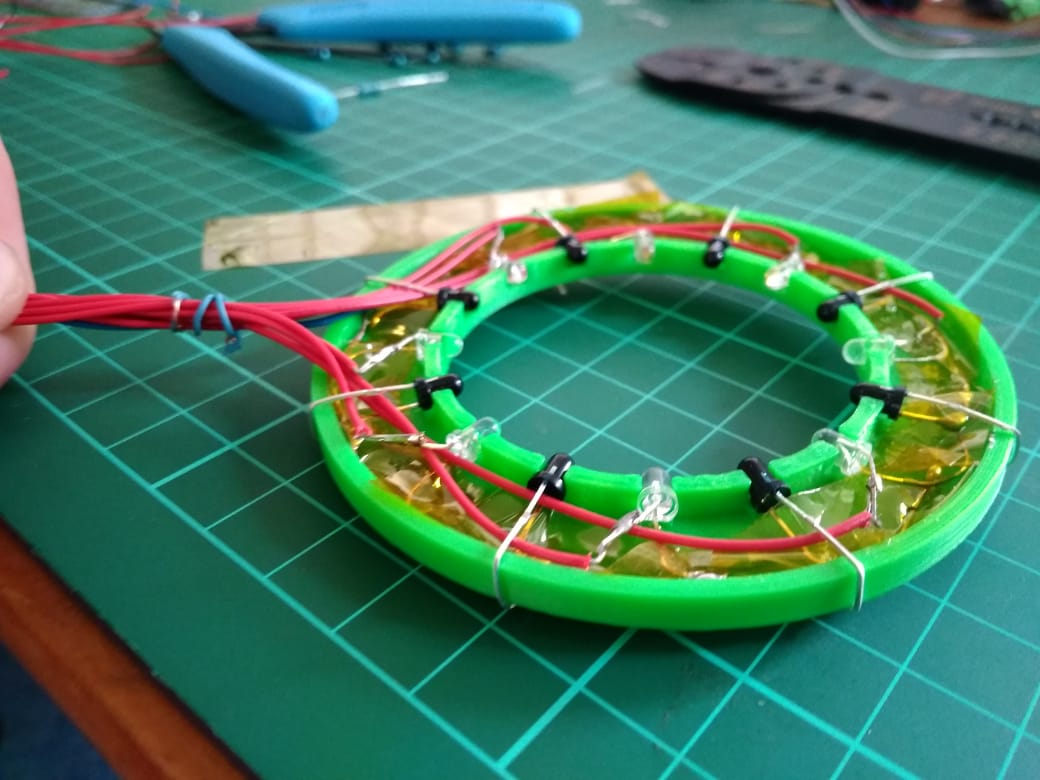
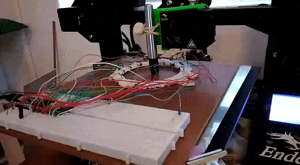
I tested out these arrangements in the real world by building some fixed arrangements, and by using a 3D printed scanner to position an LED and a phototransistor (PT from now on) in different locations to slowly simulate having many detectors and emitters. Using light as opposed to X-rays means cheap emitters and detectors, and of course much less danger.

A ring of 8 LEDs and 8 PTs. Larger rings were also constructed, and the scanner could simulate arrangements of >1000 sensors and emitters.

By taking a set of readings, we can start to estimate how much light travels along different paths, and thus build up an image of whatever is being scanned. This works well with lots of readings from the scanner:

A reconstructed image of some small nails. The scanner could resolve objects less than 1mm in size.

However, for arrangements with relatively few sensors (such as the static arrangement of 8 shown above), the reconstructed images are an apparently meaningless blur. The goal of this project was to use ML to make sense of these sets of readings, for example by identifying objects placed within the sensor ring or estimating their position.

Model Selection

To answer the question “can machine learning be useful”, I needed to pick a good approach to take. Simply throwing the data at a decision tree and then noting the performance wouldn’t cut it – every choice needs to be justified. I wrote a notebook explaining the process here, but the basics are as follows:

  1. Define your problem (for example, classifying objects) and load the data
  2. Pick a type of model to try (for example, Logistic Regression)
  3. Train a model, and see how well it performs by splitting your data into training and testing sets. Use cross-validation to get more representative scores.
  4. Tune the model parameters. For example, try different values on ‘gamma’ (a regularisation parameter) for a Support Vector based classifier.
  5. Repeat for different types of model, and compare the scores
Choosing the optimum number of hidden layers for a Multi-Layer Perceptron model (Neural Network)

For example, in the case of object classification, a neural network approach worked best (of the models tested):

Model scores on a classification task

Object Classification

Using the ring with 8 LEDs and 8 PTs, I’d place an object randomly within the ring. The object (one of four used) and location (which of four ‘quadrants’ contained the object) were recorded along with a set of readings from the sensors. This data was stored in a csv file for later analysis.

Using the model selected according to the method in the previous section, I was able to achieve an accuracy of 85% (multi-class classification) or 97% (binary classification with only two objects) using 750 samples for training. More training data resulted in better accuracy.

Model performance with more training samples for multi-class classification (orange)
and binary classification (blue)

This was a fun result, and a good ML exercise. The data and a notebook showing the process of loading the data and training models can be found in the ‘Model Selection’ folder of the GitHub repository.

Position Inference

Here, instead of trying to identify an object we attempt to predict it’s location. This requires knowing the position precisely when collecting training data – a problem I solved by using a 3D printer to move the object about under computer control.

Gathering training data for position inference

This results in a dataset consisting of a set of readings followed by an X and Y position. The goal is to train a model to predict the position based on the readings. For the ring of 8, the model could predict the location with an error of ~10% of the radius of the ring – approximately 7mm. For the ring of 14 (pictured above, and the source of the linked dataset), I was able to get the RMSE down to 1.6mm (despite the ring being larger) using the tricks from the next section. You can read more about this on my hackaday.io page.

Playing a game with the sensor ring.

The ring can take readings very fast, and being able to go from these readings to a fairly accurate position opens up some fun possibilities. I hooked it up to a game I had written. A player inserts a finger into the ring and moves it about to control a ‘spaceship’, which must dodge enemies to survive. It was a hit with my digs-mates at the time.

Using Simulation to boost performance

One downside of this approach is that it takes many training samples to get a model that performs adequately. It takes time to generate this training data, and in an industrial situation it might be impossible to simulate all possible positions in a reasonable time-frame. Since I already had a simulator I had coded, why not try to use it to generate some fake training data?

Using purely simulated data resulted in some spectacularly bad results, but if a model was ‘primed’ with even a small real-world training dataset (say, 50 samples) then adding simulated data could improve the model and make it more robust. I’ll let the results speak for themselves:

Model performance for position inference with and without simulated data for training

The simulator didn’t map to real life exactly, and no doubt could be improved to offer even more performance gains. But even as-is, it allows us to use far less training data to achieve the same result. Notice that a model trained on 150 samples does worse than one using only 50 samples but augmented with extra simulated data. A nifty result to keep in mind if you’re ever faced with a dataset that’s just a little too small!

Conclusions

I had a ton of fun on this project, and this post only really scratches the surface. If you’re keen to learn more, do take a look at the full report(PDF) and hackaday project. This is a great example of machine learning being used to get meaningful outputs from a set of noisy, complicated data. And it shows the potential for using simulation of complex processes to augment training data for better model performance – a very cool result.

I’m thinking about moving this website in a different direction as I start on a new project – stay tuned for news!

Mapping Baobabs, Part 3 – Model Applicability

In the previous two posts, we built a Species Distribution Model and used it to predict the density of Baobab trees in Zimbabwe. Then we tried some more complex models, trained a decision tree regressor and imported it into Google Earth Engine. We showed various metrics of how well a model does, but ended with an open question: how to we tell how well the model will do when looking at a completely new area? This is the subject we’ll tackle in today’s post.

The key concept here is distance from the sample space. We sampled at a limited number of geographic locations, but there is no way these locations completely cover all possible combinations of temperature, rainfall, soil type and altitude. For example, all samples were at altitudes between 300 and 1300m above sea level. We might expect a model to make reasonable predictions for a new point at 500m above sea level. But what about a point at 290m elevation? Or 2000m? Or sea level? Fitting a linear model based purely on altitude, we see the problem clearly:

Line of best fit: Elevation vs Density

Negative tree densities at high altitude? Insanely high densities at sea level? Clearly, extrapolating beyond our sample space is risky. Incidentally, if it looks to you like there are two Gaussian distributions there in the data you are not alone – they might correspond to the two types* of baobabs found on mainland Africa. Until recently, conventional wisdom held that there is only one species present, and this is still contested. See a related paper I worked on here [1]. A more complex model might help, but that’s besides the point. A model’s predictions are only valid for inputs that are close enough to the training data for extrapolation to make sense.

So how do we deal with this? A simple approach might be to define upper and lower bounds for all input variables and to avoid making predictions outside of the range covered by our training data. We can do this in GEE using masking:

Black areas fall within 80% bounds for all variables

This is a reasonable approach – it stops us doing much dangerous extrapolating outside our sample space and has the added benefit of clearly conveying the limitations of the model. But we can do better. Imagine an area that is almost identical to some of our training data, but differs in a few attributes. Now further imagine that none of these attributes matter much to baobabs, and in any case they are only just below our thresholds. Surely we can expect a prediction in this area to have some value? We need a way to visualise how far away a point is from our sample space, so that we can infer how bad our predictions for that point are likely to be.

Enter what I call the |Weighted Distance Vector|. We represent each input as a dimension. We consider how far away a point is from our sample space along each dimension, and compute the vector sum of these distances. I say the ‘weighted’ sum since we can scale the distance on each axis to reflect the relative importance of that variable, attaching higher weight to variables with larger effects on the output. Let’s clarify with an example.

Considering only two variables, elevation and temperature, we can represent all our training data as points (blue) on a grid where the X axis represents elevation and the y axis temperature. We’ll draw out our limits around the training data using bounds covering 90% of our data. A point within the limits has a |WDV| of 0. Now consider a point outside the limits (red). It’s 250m higher than any we’ve seen – 0.25 times the range of elevations observed. It’s 2.5 degrees cooler than any of our sampled locations, which is 0.3 times the upper-lower bounds for temperature. The distance is sqrt(0.25^2 +0.3^2) = 0.39. However, altitude has a large influence on distribution, while temperature does not. Scaling by appropriate weights (see the penultimate paragraph for where these come from) we get |WDV| = sqrt((0.173*0.25)^2 +(0.008*0.3)^2) = 0.043. The key point here is that the |WDV| captures the fact that elevation is important. A point at 750m elevation with a mean temp of 30 °C will have a low |WDV| (0.005), while one with a mean temp of 23 °C but an altitude of 1600m will have a high |WDV| (0.02).

A point outside our sampled region

To do this in GEE is fairly simple, since we can map functions over the input images to get the |WDV| at each location. This script shows it in action. And the result gives us much more information than the mask we made earlier. Red areas have a very small |WDV|, and we expect our model to do well there. White areas are out of scope, and I’d take predictions in the yellow regions with a grain of salt. What isn’t included here is geographical distance – extrapolating to different continents, even if conditions match, is not advised.

|WDV| over Southern Africa. Red areas are similar to sampled regions, white are not.

One thing I’ve glossed over so far: how do we get the weights used? I defined the |WDV| as weighted because we “scale the distance on each axis to reflect the relative importance of that variable.” The feature weights can be thumb-sucked by an expert (I’ve seen this done) but the easiest way to get reasonable weights is to look at the model.feature_importances_ variable of a trained random forest regressor. In the process of fitting the model, the relative importance of each input feature is computed, so we get this info for free if we’ve done the modelling as described in Part 2. Another option would be to use the correlation coefficients of each input var with the density. I leave that as an exercise for the reader.

So there you go – a way to visualise how applicable a model is in different locations, using weighted distance from sample space as a metric. In the next post of this series I’ll share the method I’m using to expand our sample space and get a model that can produce useful predictions over a much wider area. Before then, I’m going to take a break from baobabs and write up some other, smaller experiments I’ve been doing. See you then!

*I’m using ‘type’ instead of ‘species’ here, because while the genetics are contentious, it is fairly clear that there are at least two kinds of baobabs here.

[1] – Douie, C., Whitaker, J. and Grundy, I., 2015. Verifying the presence of the newly discovered African baobab, Adansonia kilima, in Zimbabwe through morphological analysis. South African Journal of Botany, 100, pp.164-168.

Mapping Baobabs, Part 2 – Qualifying Model Performance and More Complex Models

Update, July 2020: GEE now has a good random forest implementation (ee.Classifier.smileRandomForest) that can do regression – I’d suggest using that instead of the approach mentioned in this post.

Recap and Following Along

The last post looked at creating a simple linear model to predict the density of baobab trees across Zimbabwe. In this post, we’ll try to quantify how accurate the predictions are and then see if we can make them even better. Since we’ll want to try all kinds of models, we’ll take a break from Google Earth Engine and use Python (with scikit-learn) to play with some concepts before taking our final model back into GEE again.

I’ll be working in a Jupyter notebook. This gives an interactive environment, perfect for trying out ideas and experimenting. If you’d like to follow along, I’ve uploaded the data and a complete notebook <here>. It goes much deeper than I’m able to in blog form – consider this post a summary rather than a comprehensive explanation of the topics involved.

Loading the data

I’m using a library called pandas to load the training data (which we made to train the model in GEE) into a data structure called a DataFrame. Think of it as a spreadsheet, with columns representing the input variables (altitude, rainfall etc) and the output variable that we intend to model (in this case, tree density).

Loading the data into a pandas DataFrame

Model Performance

We need ways of gauging model performance so that we can decide how reliable the predictions are or choose between two models. An easy way to do this is to hold back some of the training data and see how well the model performs with it. We train a model with, say, 80% of our data and then make predictions on the remaining 20%. The closer the predictions are to the true values, the better the model has done. Let’s see an example:

The data has been split into training and test sets. X represents the inputs to the model and y the desired outputs. So here, we train the model with X-train and y_train and then see how well it does on the unseen test data. But hang on, what does model.score() even do?

The score shown is known as the ‘R-Squared Score’. It is a measure of how well the model explains the variance in the output variable. Scores closer to 1 are better. We’ll use this going forward, but it isn’t very easy to understand (read more here). A quick way to get a more intuitive understanding of how well a model does, I like to plot the models predictions vs the actual figures. An ideal model would predict the outputs 100% correctly, resulting in a straight line (y=x). The closer to this ideal we get, the better our model is. Here we go:

Hmm, that’s not much like a straight line. But there is some relation – an encouraging sign. Also, the X axis (actual densities) seems to be appearing in increments of 25 – what’s up with that? Well, the data is split into very small plots (4ha each). In an area where the baobab density is 50 trees per square km, one plot might have 2 trees (giving a density of 50 trees/km^2), another might have none (density=0) and a third might have 5 (density=125). To smooth things out, we can clump adjacent plots together. This will give us fewer, larger plots, each with a better density figure. The code for this is in the accompanying notebook. Repeating the scoring process with this new input data, we get the following:

Better, and the score has improved. But still not great – for example, the model predicts a density of -100 trees/km^2 in some places. However, this gives us a starting point.

Using a single test/train split gives an idea of performance, but we can get more accurate scores by doing multiple splits (look up cross-validation for more info). It’s also important to think about HOW we split. Splitting randomly might be fine in some cases, but here the data was collected as we drove along roads. Having test points right next to training samples means the model can sometimes make a good guess, but we want to know how well it will perform in new areas, not just along roads we’ve sampled. A better approach is to split the data into sections – each represents a new area with different conditions, and more accurately represents the challenge. Going forward and looking at new models, I’ll record the score for both cases in CV (random) and CV (non-radom) respectively. More info in the notebook and a future post. I’ll also show scores with both the original training data and the resampled data (larger plots) for comparison.

Final bit in this section: let’s clear our heads by getting another measure of performance. Imaging we’ve driven 80% of the roads, and want to predict how many baobabs we’ll see on the final stretch. We’ll do it for this model (and all the following models) and compare:

Quite the error!

The summary score for the linear model:
Random split: 0.169 (train), 0.152 (test)
Sequential Split: 0.172 (train), -0.549 (test)
And Re-sampled plots
Random split: 0.257 (train), 0.213 (test)
Sequential Split: 0.262 (train), -1.119 (test)

Adding Polynomial Features

The linear model essentially fits a set of straight lines to the data. density = a*altitude + b*temperature +… . This doesn’t work when more complicated relationships are at play. To arrive at a model that can fit more complex curves, we can add polynomial features and re-run the line fitting process. This lets us more accurately describe curves (y = 0.3x + 0.2x^2 for example). There is an excellent write-up of polynomial regression on towardsdatascience.com (which also has excellent resources on linear regression and other types of modelling with scikit-learn).

Adding quadratic features (altitude^2 etc) gives a better R^2 score for a random split of 0.22, up from ~0.15 for Simple Linear Regression. Adding cubic features gives a further boost to 0.26. However, both models do even worse when the data is split sequentially – in other words, these models don’t generalize as well.

Decision Trees

We could keep on refining the simple models above, adding regularization parameters to help them generalize better, for example. But let’s move on and try a new kind of model – a decision tree. This post is already getting long, so I’ll leave an explanation of decision trees to someone else. Suffice to say that decision tree methods give a series of true/false splits that can be followed to get a prediction for a given set of inputs. For example, a simple (depth=2) tree predicting the baobab density looks like the following:

We can set how complex we want the decision tree to be by changing the max_depth parameter. Too simple, and we don’t account for the trends in the data. Too complex, and we ‘overfit’, reducing our model’s ability to generalize by fitting noise in our training data. We can make trees of different depth, and see how this affects the score. Observe the following two graphs:

Model score with varying max_depth parameter

More complex models do better but are worse at generalizing. Since we don’t see much of an improvement in score for randomly split data above a depth of 10, and beyond that, the score on unseen data (when we split the data sequentially) gets significantly worse, a max depth of ~10 would be a reasonable parameter choice.

Comparing the prediction for the last 20% of the data (as we did with the first linear model), we see that this gives a much closer estimate:

Prediction of the total within 15%.

Random Forests

Random forests are a great example of the value of ensemble modelling. By creating a set of different decision trees, each of which does a mediocre job of making predictions, and then averaging the predictions to weed out extreme errors, they arrive at a more probable prediction. There is more to it than that, but let’s just try a couple out and see how they do:

Results

Exporting Decision Trees for use in Google Earth

Our best model was used Random Forest Regression (which could be further improved with some extra tweaks), and this is what I’ve used previously for some Species Distribution Modelling tasks. However, Google Earth Engine doesn’t yet have support for doing regression (not classification) with random forests. A reasonable second place is Decision Trees, which have the added bonus of being computationally cheap – important when you’re working with gigabytes of data. We’ll export our best performing decision tree from python and load it using GEE’s ee.Classifier.decisionTree(), which takes in a string describing the tree.

I wrote a function to export a tree from scikit-learn into GEE’s format. Code here <add link> and example usage in GEE here <add link>.

The finished map doesn’t look as good as the smooth output of the linear model, but the predictions are more accurate.

Where Next?

At this point we’ve looked at model accuracy, chosen a better model and applied that model in Google Earth Engine. We know roughly how well it does in areas similar to those we sampled. But is it reliable elsewhere? Would you trust the predicted densities for France? The model says lots of trees, but the French say il n’y a pas de baobabs and we both know who is right. To clear up these questions, we’ll spend the next post exploring the idea of model applicability, coverage of sample space and pitfalls with extrapolation. See you there!

PS: This is still a draft but I’m hitting publish so that I can move on to the next one. I’ll refine it later. If you’ve hit a missing link or error write to me or wait a few days. Fortunately I don’t have readers yet. I hope I remember to come back to this.

Mapping Baobabs, Part 1 – Modelling the Density of Baobab Trees in Zimbabwe with a Linear Model in GEE

This is the first in a multi-part series exploring Species Distribution Modelling (SDM) with the Google Earth Engine. In this post, we’ll take a look at the data we’ll be using, load up some environmental layers and create a simple linear regression model.

Background

Google Earth Engine

Google Earth Engine (GEE) is an amazing tool for working with spatial data on a global scale. By writing some simple javascript, it’s possible to run computations on vast collections of image data thanks to the processing power hiding behind the scenes. Check out https://earthengine.google.com/ for more info.

The Tree

The African Baobab (Adansonia digitata and Adansonia kilima [1]) is an important tree in all countries where it is found. Besides its iconic looks, it provides tasty fruit full of good nutrients [2], bark fibre for crafts [3], traditional medicine [2], shade and an extra source of income [4] in some of the driest and most marginalized communities. Commercialization of the fruit is on the rise, especially for the export market. This is largely due to the fruit’s status as a ‘superfruit’. It’s important that organizations looking to harvest the fruit for sale have good information about the tree population so that they can pick good locations, estimate productivity and make sure that they are not over-harvesting and damaging this incredible resource.

In 2014, I was part of a team that set out to gather said information in Zimbabwe. We travelled all over the country, counting trees, assessing tree health, logging information about tree size and appearance and using questionnaires to find out more about how the trees were viewed and used by the communities who lived near them. This allowed us to produce a good map of the distribution within Zimbabwe, estimate potential yield in different areas and deliver a report on the overall health of the population. We also confirmed the presence of the newly discovered Adansonia kilima [5] – a second species of Baobab on mainland Africa that had only recently been described.

For that project, mapping the density of baobab trees was a tough task. I had to source gigabytes of data (not easy with Zimbabwe’s internet infrastructure), write some custom code to slowly crunch the numbers, tie together my own scripts with add-ons to QGIS (mapping software) and wait days for models to run. As you’ll see in the next few posts, Google Earth Engine makes the job significantly easier.

The data

There are two main types of data used in SDM. One is occurrence data – this can be points or areas where a species is known to occur. This is useful for calculating the probability of occurrence and creating maps showing where a species might be found, but less useful if you are trying to estimate density. The second type is ‘count data’ – the number of frogs in 10m2 or the total number of sightings along a transect. With count data, one can begin to predict how many of something will be found at a given location.

The data we collected in 2014 is count data – all the baobabs along road transects and walked transects were counted and their locations logged. The transects were subdivided into 200m by 200m plots, and each plot has an associated count – the number of baobab trees in that plot. There are 14,683 of these in the dataset, representing nearly 60 thousand hectares sampled. We could have subdivided the transects differently to get fewer, larger plots but we’ll leave that as a subject for a future post.

Loading input layers

Environmental Data

Google Earth Engine has a vast amount of data available with a few clicks. We want to examine all the factors that could affect where a tree grows. You can go really deep here, but since this post is just a first rough pass we’ll grab some climate-related layers and altitude (the latter because every document on baobab mentions that it is important). You could try searching directly for things like temperature, rainfall etc, but conveniently an org [check] called Worldclim has put together 19 variables derived from climate data that they deem “biologically meaningful values”. These include temperature seasonality, max rainfall, etc. Search for ‘worldclim’ and select ‘Worldclim BIO Variables V1’, which will give you a description of the dataset and allow you to import the data. Hit ‘Import’ and give it a sensible name – it will appear at the top of your script.

Add a second import with some elevation data. Elevation data is available in up to 30m resolution, but since we’re working on a large scale and the climate data is 1km resolution, using 30m resolution elevation data is a little overkill, and will slow things down. “ETOPO1: Global 1 Arc-Minute Elevation” is a lower resolution image we can use, or you can resample the high-res layer (see part 3 of this series for examples).

Sampling

We need to create a training dataset that contains both the baobab density (from the count_data file) and the environmental layers (represented by bands in merged_image). Fortunately, GEE has a function to simplify this. We sample the image at each point:

var training = merged.sampleRegions(cd);

Training now contains a list of features. Each looks like this:

We can use this to train a model

Creating and training the model

Google Earth Engine provides a variety of models for us to choose from. For this post, we’ll stick to a simple linear model, available via ee.Classifier.gmoLinearRegression. We create the model, set it to regression mode (since we’re predicting density, a continuous variable) and train it with our prepared training data:

The model can now be applied to predict the density in different locations. We can use a different set of points and prepare them the way we did the training data, or we can simply apply the classifier to the whole image. The band names must match (see docs for details). Since we’ll use the merged image used for training, no further prep is needed:

var classified = merged.classify(trained);

Map.addLayer(classified);

Tweaking the visualization parameters gives us our result:

The output can be saved as an asset or exported to Google Drive for later use.

Conclusion

There are many improvements that could be made, but this model is already very useful. Within the study area, it is fairly accurate (we’ll examine this in a future post) and it shows where baobabs can be found, and where we should expect high densities. In the next few posts, we’ll examine some better models, quantify model accuracy, map model applicability (i.e. where the model can be expected to produce useful output), experiment with different sampling techniques and so on.

If you have questions, please get in touch!

You can see a full demo script at https://code.earthengine.google.com/3635e796d66d348c2d3a152430dc1142

References

[1] – Pettigrew, F.R.S., Jack, D., Bell, K.L., Bhagwandin, A., Grinan, E., Jillani, N., Meyer, J., Wabuyele, E. and Vickers, C.E., 2012. Morphology, ploidy and molecular phylogenetics reveal a new diploid species from Africa in the baobab genus Adansonia (Malvaceae: Bombacoideae). Taxon, 61(6), pp.1240-1250.

[2] – Kamatou, G.P.P., Vermaak, I. and Viljoen, A.M., 2011. An updated review of Adansonia digitata: A commercially important African tree. South African Journal of Botany, 77(4), pp.908-919.

[3] – Rahul, J., Jain, M.K., Singh, S.P., Kamal, R.K., Naz, A., Gupta, A.K. and Mrityunjay, S.K., 2015. Adansonia digitata L.(baobab): a review of traditional information and taxonomic description. Asian Pacific Journal of Tropical Biomedicine, 5(1), pp.79-84.

[4] – Alao, J.S., Wakawa, L.D. and Ogori, A.F., Ecology, Economic Importance and Nutritional Potentials of Adansonia digitata (BAOBAB): A Prevalent Tree Species in Northern Nigeria.

[5] – Douie, C., Whitaker, J. and Grundy, I., 2015. Verifying the presence of the newly discovered African baobab, Adansonia kilima, in Zimbabwe through morphological analysis. South African Journal of Botany, 100, pp.164-168.

Curious correlations

I wanted to write this up to show how easy it is becoming to test ideas and find interesting trends in data. Please don’t draw too many conclusions from the numbers here – pinch of salt and all that.

Yesterday I came across the Wellcome Trust Data Re-Use Prize: Maleria. They have made tons of data available, and invited participants to generate a new insight, tool or health application from that data. Incredible to see such great initiatives.

Browsing through the data, one map in particular drew my attention – the ‘Residual Means’. These “show the remaining (residual) transmission that has not been accounted for by the covariates already in the model.” Doesn’t that smell juicy?

Explaining this unattributed transmission is one of the example questions provided. It would be neat to see if we can figure out why malaria infection rates are higher than expected in some areas, and lower in others.

I was looking at all this as I procrastinated some work I’m doing mapping baobab trees. It occurred to me that it wouldn’t be completely absurd to see if there is any relation between the two subjects. Now you’ll just have to take my word on this for now, but rest assured that I have a decently accurate map of baobab tree density for Zimbabwe and surrounds. I quickly downloaded the residuals maps and fired up QGIS to take a look.

This isn’t the density map I used, but it is similar and looks prettier

Estimating correlation by looking at two maps and saying “there seems to be some patterns here” is not an established scientific practice, but it is fun to see the brains pattern-matching functions get abused. After a few minutes the fun wore off and I got down to the serious business. I want to see if there is a correlation between baobab density (or rather, access to baobab fruit) and malerial transmission/infection.

Stackoverflow “get raster value at point” since it’s been a while. Wow – I don’t even have the gdal toolbox on this laptop yet! Technical hurdles out of the way, I threw together some code:

Full code listing on Github <LINK>

Creating regularly spaced points over the area of interest (i.e. the area I have baobab densities for), I use the above code to sample the baobab density and the transmission residual at each point. Next, we check to see if they’re correlated:

scipy.stats.pearsonr(densities, maleria_residuals) yields a correlation coefficient of -0.1226401351031383, p=0. That is, places with more baobabs have less unattributed transmission than places without. To show this visually, let’s look at a scatter plot of the two variables:

Scatter plot – unattributed transmission vs baobab density

Places with high baobab density have inexplicably low transmission rates, in general. In fact, 86% of locations with estimated baobab density >10 trees/hectare had a negative ‘unattributed transmission’ value.

At this point, my half-hour break should have ended, but I was interested. I had mainly done asked the question as an exercise in seeing how easy it was to play with the data. But there was a correlation (note: correlation != causation). Now it could well be that baobab trees and malaria transmission are both dependent on some of the same environmental factors, some of which might not have been taken into account by the model. But could it be the case that this wonderful tree (I’m a little biased) might be doing some good?

Baobab fruit is good for you [1]. It’s got lots of minerals and vitamins, and my initial hunch was that maybe, just maybe, it could be boosting the health of any community who lives close to the trees. Another angle came up when I looked for sources for [1] and found references to the use of baobab in traditional medicine as a treatment for malaria [2, 3]. Now curious, I looked around and found a study [4] suggesting “that Adansonia digitata protects against Plasmodium berghei induced-malaria, and that administration of the extract after established infection reduced malaria progression.” (in mice – from the [4]).

To sum up, we’ve looked at the malaria data and found that there are some variations in the transmission rates that the current models can’t explain. We’ve then examined the relationship between baobab tree density and malaria transmission residuals and noted that there is a small negative correlation. We’ve seen that areas with baobabs present tend to have lower transmission rates than expected, and presented the idea that this could be due to the health benefits of the fruit or the anti-malarial properties of the bark, which is often used in traditional medicine. All done, thank you very much, can I has my PhD yet?

Science isn’t quite that easy. I share this story to show how rapidly you can start generating hypotheses and playing with data. But to give a rigorous answer will take a little more than an hour coding and an hour smugly writing a blog post. I can think of a few reasons why the results here should be taken with a large pinch of salt, and I leave it as an exercise for the reader to list a whole bunch more. Hopefully soon I’ll have time for a follow-up, doing it properly and explaining how one should actually go about it.

For now, cheers

References

[1] – I had some sources, but it’s more entertaining if you google ‘baobab superfruit’ and then ignore the most enthusiastic 90% of results. But see [2] for some good info (available online at https://www.sciencedirect.com/science/article/pii/S222116911530174X#bib4)

[2] – Rahul, J., Jain, M.K., Singh, S.P., Kamal, R.K., Naz, A., Gupta, A.K. and Mrityunjay, S.K., 2015. Adansonia digitata L.(baobab): a review of traditional information and taxonomic description. Asian Pacific Journal of Tropical Biomedicine5(1), pp.79-84.

[3] – Kamatou, G.P.P., Vermaak, I. and Viljoen, A.M., 2011. An updated review of Adansonia digitata: A commercially important African tree. South African Journal of Botany77(4), pp.908-919.

[4] – Adeoye, A.O. and Bewaji, C.O., 2018. Chemopreventive and remediation effect of Adansonia digitata L. Baobab (Bombacaceae) stem bark extracts in mouse model malaria. Journal of ethnopharmacology210, pp.31-38.

Christmas games – simulation and lazy stats

This Christmas, I was introduced to several new games by my new extended family. Much fun was had making up new games and rediscovering old, but one game annoyed me slightly. A dice game that involved rolling handfuls of dice for different scores and racing to 10000 points – known to the family as ‘Farkle’ but with rules that made it closer to ‘Dice 10000’, also called ‘Zilch’. What bothered me was the fact that, despite much talk of techniques and riskiness, most players tended to follow the same basic strategy, leaving the outcome to chance. As you’ll see, the rules are just complex enough that basic stats thinking / human intuition aren’t always able to give a quick answer as to which choice is best. Anyway, having lost badly on Christmas Day I went home, thought about it for a bit and then spent an hour or two on Boxing Day coding a simulator to test some of my hypotheses. This post documents my experiments.

Here is a basic description of the rules, adapted from http://zilch.playr.co.uk/rules.php

1. Roll the dice

You start your turn by rolling all six dice.

2. Scoring dice? Take some points

If you rolled some scoring dice then you need to take some of those points before you can roll again. See table for scores.

3. No scoring dice? Turn ends.

This means that all the points you took so far are wiped out. You bank no points and it’s the end of your turn. If this is your third zilch in a row then you lose 500 points.

4. Scored 300 or more? Bank the points.

Once you have taken some points you can choose to bank them or keep on rolling the dice. If you bank the points then they are added to your score and your turn is over. If you decide to carry on rolling (see rule 5) then you could roll more scoring dice (see rule 2) but you could also get no scoring dice and end the turn with nothing (see rule 3).

5. Re-roll the remaining dice

You can re-roll any dice that you didn’t score with. Once you have scored points from all six dice you can roll again. In fact, whenever you end up in a situation in which all six are scoring dice, you *must* re-roll.

Scores:

  • Two 3-of-a-kinds: 2500
  • Three pairs: 2000
  • Run of 6 (1, 2, 3, 4, 5, 6) = 1500
  • Three of a kind: the number x 100. Three fours = 400. Exception for ones: three ones = 1000. Every additional dice of the same number doubles the score – four fours = 800.
  • Ones: 100 each
  • Fives: 50 each

To further explain the scoring strategy, let’s look at some example rolls:

[1, 2, 3, 2, 4, 2, 5] – Three 2’s = 200. One 1 = 100. One 5 = 50. The player could keep all scoring dice, bank a score of 350 and end their turn there. They could also keep all scoring dice and choose to re-roll the two non-scoring dice (high risk) or keep a subset of the scoring dice (say, just the 1) and re-roll the rest, hoping for a better total.

[1, 1, 3, 3, 5, 5] – Three pairs, scores 2000 points but the player must roll all six dice again (rule 5). When they do, any prudent player would take any score they can and bank their points, rather than risk the high score by rolling fewer than six dice.

[5, 6, 3, 6, 3, 2, 2] – Only scoring dice is a 5. Player chooses to re-roll the remaining 5 dice and gets [2, 2, 3, 2, 5, 1]. Keeping all scoring dice for 350 plus the 50 from the first roll’s 5. Banks 400 rather than choosing to roll the last non-scoring dice

Building a simulator

Github: https://github.com/johnowhitaker/farkle_sim – follow along in the Jupyter notebook for the code

My goal here was not a full, rigorous treatment of the game to find an optimal strategy. Instead, I merely wanted to answer simple questions like ‘Playing like most people, at what score should I bank rather than risk another roll?’ or ‘With my current strategy, what is my expected average score?’. If you are interested in a more in-depth analysis, check out http://www.mattbusche.org/blog/article/optimal_farkle/ and http://www.mattbusche.org/blog/article/zilch/ where Matt models Farkle as a Markov Decision Process and uses value iteration to hone in on an optimal strategy.

To start with, I create the simplest possible player. It must keep track of its current score (self.temp_score, the sum of all scoring dice kept) and banked score (self.score, the total score banked in previous turns) and how many dice have bee kept, which tells us how many are available for re-roll and whether or not the player has ‘zilched’ (rolled without getting any scoring dice).

class BasicPlayer:
def init(self, name):
self.name = name
self.score = 0
self.temp_score = 0
self.keeping = []

To make it easy for me to extend this basic player later, I define a turn() function that rolls the dice, tracks the score and re-rolls if necessary but I offload the actual strategy logic into another function process_roll() which I can override with more complex strategies later. process_roll() takes a list of dice rolled, appends dice to be kept to self.keeping and updates the score. It returns a True/False (Boolean) value for whether or not the player should roll again and another for whether or not the turn failed. In this most basic case, the player simply keeps all ones and fives rolled, re-rolling if there are 3 or more dice left. This is definitely NOT an optimal strategy but will help check that everything else works. See the BasicPlayer class for the turn() code.

def process_roll(self, roll):
# Returns: (roll_again (bool), fail (bool)
self.kept = 0 # How many dice kept (must be at least 1)
for d in roll:
if d == 1:
self.keeping.append(1)
self.kept += 1
self.temp_score += 100
if d == 5:
self.keeping.append(5)
self.kept += 1
self.temp_score += 50
if (self.kept) == 0:
return (False, True) # Scored no points this roll
elif len(self.keeping) > 3:
return (False, False) # Scored points, 2 or fewer dice remain (so don’t roll again)
else:
return (True, False) # Scored points, and there are 3 or more dice to play with – recomment roll again.

This basic player scores about 214 points in an average turn, but it doesn’t follow all the rules. The next step was to establish a baseline player that followed the rules and had some simple strategy. The process_roll() function now takes all available scoring dice and chooses to re-roll if there are 3 or more dice remaining. This is pretty much what all the players I watched will do, although they will generally bank instead of taking the risk of rolling three dice provided their score is >200 (or >400 if they’re ‘feeling risky’). This baseline player does pretty well despite some obvious flaws, with an average score of ~743. Because of the random nature of the game and the small chance of very high scoring turns (two 2000 point rolls in a row for eg), we need to simulate a lot of turns to get a decent average. 10k turns is enough to show that this baseline player gets 700-750 and well outperforms the BasicPlayer one, but for more subtle improvements I have been running >1 million simulated turns to get reliable results. Luckily, computation is cheap and even my laptop can handle that many number-crunches in seconds.

Refining the strategy

At this point, we’re ready to start asking the questions I had thought of as we played the day before. First up, when should one bank instead of rolling with three dice left?

We make a new player, which takes a number as an argument. If the temp score is below this threshold, it rolls again with three dice (as before). If the score is above the threshold, it banks the score instead. AllRulesThreshForThree is born, and averages closer to 790 when it banks scores above 500. Plotting the average score for different thresholds, we see that anywhere between 400 and 600 does best in this case:

Figure 1 – Performance with different thresholds for rolling with three dice left

Average score is instructive, but I’d like to point out at this point that the point of the game isn’t to get the best average score over one million turns. The point is to be first to 10000. In some cases, especially with lots of players, playing risky will lower your average score but increase the chance of a high score occasionally. Instead of going solely by average score, I’ll also test strategies by pitting them against each other and seeing win percentages. See compare_players(players, n_rounds) in the notebook.

Pitting the baseline player (AllRules) against one that banks on three with a score of 500 or more (AllRulesThreshForThree), we see confirmation that banking with three dice left pays off, winning 52-53% of the time. One thing I do want to note here: even though this strategy yields an average score of 790 vs 740, it still loses 48% of games. I found that even my best strategies didn’t do much better, cementing this game as one of almost pure chance in my mind. Yup, way to suck the fun out of it. I’m sorry.

Back to optimising strategies. The next question I wanted to investigate was whether it was worth keeping those low-scoring fives. One quick modification to the process_roll() logic, which now keeps 5s only if the alternative is going out (self.kept=0) or if we’ve already kept enough other dice that we may as well take anything left with a score (self.kept > 2). Up until now, I had suspected how things would go – improvements were obvious. But this was a question I had no idea about – given [1, 5, 2, 3, 2, 3] was it better to keep just the 1 and re-roll five dice for a better chance at 3 of a kind? Or was it worth keeping the 5 as well and re-rolling four? Turns out, better to only keep 5s when you have to – a strategy improvement that brought the average score up to 808 points per turn.

Risky play as an advantage

I tried some other random changes, but at this point, the best average score seemed to be around 808, re-rolling with three dice if score < 500 and only keeping 5s when necessary. But, as mentioned earlier, I had a suspicion that risky play might work out when playing with larger numbers of players.

Let’s examine just one type of risky play to investigate this. When 5 scoring dice are rolled, a player may choose to roll the single remaining dice. Since the only ways to score with one dice are 1 and 5, there is a 33% chance of success. But success means another roll with all six dice, and potentially even higher scores! So, the player is taking a chance in order to get a higher score 1/3 of the time.

I coded up a player with this behaviour. It includes a threshold – for scores over this threshold, it won’t risk it (neither would you). Initially, this threshold was set at 500. Since it’s relatively rare to get less than 500 points while using all but one dice, the risky play doesn’t hurt the average score much – it drops to ~806. But this is where things get interesting: with three players (one baseline, one playing the best strategy found so far and one playing with this added risky behaviour), the risky player wins slightly less games then the top ‘best’ player. As one might expect given the slightly lower score. But the difference in win percentage is only 0.5%. And when we add more players, a different result emerges.

With 6 players playing the ‘best’ strategy and one taking risks (risking a single dice roll with scores < 700), the risky player still has a lower average score (only 803) BUT it wins more than 1/7 of the time. In other words, the risky behaviour pays off in larger groups. Here are the total wins after each player has had 3 million turns:

wins = {'dump5s1': 65559,  'dump5s2': 64978,  'dump5s3': 65293,  'dump5s4': 65080,  'dump5s5': 65238,  'dump5s6': 65160,  'risks1': 66318}

And the average scores:

dump5s1    807.679317 
dump5s2 806.118700
dump5s3 806.327633
dump5s4 806.029383
dump5s5 806.765667
dump5s6 807.170067
risks1 802.735333

So, a strategy that wins in two-player mode (dump5s1 beats risks1 50.4% of the time) might not be best in larger groups.

Conclusion

I hope you’ve enjoyed this little experiment. Game theory is complex, but I hope I’ve shown how with a little bit of programming knowledge and a simple enough game you can start testing ideas and playing around in a very short amount of time.

I scratched my itch, and the day after boxing day I followed my optimum strategy diligently and lost a string of games, much to the amusement of all. But I’m happy nonetheless. An afternoon of banging out code, testing ideas and relaxing while my computer simulates billions of dice rolls counts as a win in my book 🙂

__init__(self): What is this blog

Welcome!

In this first post, I figured I’d lay out the goals of this blog and explain a bit of background. As soon as I’m done writing this I’m planning on following up with the first proper post. With luck, this intro will be the only post ‘fluff’ post you’ll see here.

Let’s start with me. My name is Jonathan Whitaker. I’m an Electrical Engineer with a Data Science background, currently pursuing some personal research projects while my wife and I take a working vacation around Zimbabwe. For the last 5 years I’ve been writing code to solve problems. Big, important problems for work. Small, interesting projects for fun. Obscure, not-quite-problems because something bugged me and I thought “I can do that better”. I’m hoping that this blog will become a place for me to share these solutions and associated musings.

I’ve called the blog ‘The Data Science Cast-net”. This is because I have developed a fairly chronic case of something I call the data science mindset – something I try to instil in my students when I teach this stuff. In essence, this is a mental practice of looking at pretty much everything as a data science problem. Looking for somewhere to live? I can map travel times, house prices, crime rates etc to efficiently narrow down the search. Idly wondering how a romantic relationship is affecting your health? Google Fit makes all sorts of data available – we can compare different years and do some fun statistics to see if you’re walking more or less now that you’re hitched. And so on, down a slippery slope that ends with you tracking all aspects of your life and thinking in terms of variables and models far too often. Now, armed with the tools to make sense of data, I am throwing my cast-net out into the world and seeing what interesting information-fish I can pull in.

I look forward to sharing this experiment with you.